The ingenious new sync subtitles feature on VLC for Android.
January 1st, 2021
3 minutes

VLC for Android has a new way to synchronize subtitles without having to guess the times.
Although VLC has never been complimented much for its design, it has been the G.O.A.T. media player due to its utilitarian nature and of course for being an open source project. It also became available on Android Phones in December 2014.
It has been my go to media player on my phone ever since! It is not as snappy as I want it to be, but just like its desktop counterpart, has a somewhat utilitarian design.
But, recently I discovered the revamped subtitle synchronization feature which I believe is almost the best design that we can achieve for this feature.
The Problem with subtitle synchronization
It often happens that when I am watching a video on VLC I download the subtitles for the video from its built in web-search system, but the downloaded subtitles seem to be out of sync with the audio. This ends up with me downloading other versions of the subtitles and trying to see if they sync up. Eventually I end up losing interest in the video due to all the disruption in the flow.
This reveals us two problems in this scenario:
- I was downloading redundant information.
- I was still not able to sync the subtitles with the audio.
Previously, to solve these issues, they introduced the sync feature that presented a text-box where you enter the time gap (either a positive or a negative value) by which the subtitle was off and try to sync it up with the audio. This was always a guess work. It wasn't clear on what the value in the text-box meant — was it fixing the time gap from the audio's perspective or from the subtitle's perspective? And how am I going to keep track of the time gap so precisely? I am sure many VLC users have faced this struggle and again ended up downloading other versions of the subtitles. So, even though they tried to address this issue, the solution was not quite there.
The New Solution after the Revamp
If you think about this problem afresh, the system just needs answers for 2 parameters: what is ahead and by how much to synchronize the audio with the subtitle. The system can't be blunt about it and ask the two questions directly to the user. Because honestly, the user doesn't know the answer to the second question.
Now if we try to design an interface to address the 1st question — what is ahead? We can simply do that by showing two buttons on the screen, one for subtitle and another for audio and asking the question. The user can tap on one of these to answer the question.
Moving to the 2nd question where the actual magic happens — by how much? The app can never expect the users to know or calculate the value. However, it can surely take their help to calculate it on its own. The two buttons which we designed for the previous question can be leveraged here to calculate the value. We can do so if we tell the users to tap the buttons in the order of what stimuli comes first followed by the next button when they see/hear the next stimulus. To do that we need to rephrase the questions we ask the user into something much more simpler.
Instead of asking "what is ahead and by how much?" we can say (note the order) "tap the audio/subtitle button if it is ahead and when the subtitles/audio catch up, tap the subtitle/audio button." Although the statement is complex to be asked to a user, we can convey the same message easily with an interface. What we achieve by this is that by the end of the second tap the system will know what was ahead and can calculate what the time gap was and can now synchronize the two.
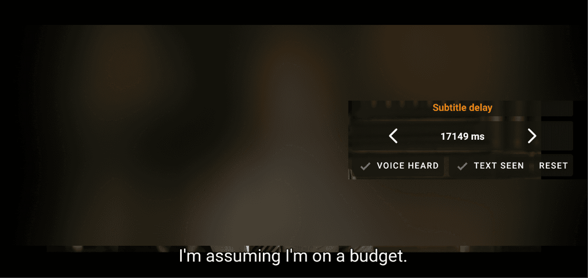
This is what VLC for Android did and here is how it looks:

If you hear the dialogue first, you tap the "Voice Heard" button and when you see the corresponding subtitle, you tap the "Text Seen" button (can also be the other way around) and voila! They are now in sync! Sometimes, if the user taps the buttons after a delay, it may lead to a slight issue with the sync, but no worries, they can do it again using the reset button and fix it easily.
I have not seen this feature in any other media players on any platforms not even on the VLC Player on desktops. Probably this is the first time it has been implemented so elegantly and I love it!
When I first tried this feature, I didn't understand it completely but I think we an improve this further by changing the interface design. I asked a few of my friends to see how they felt. And their thoughts were a mixed bag. Some were okay with it and some didn't understand what it did.
If I plan to improve this interface, I want to know who the exact users of this feature are. Based on my initial analysis of my friends' reactions and opinions this feature seems to be used mostly by users who are between beginner and pro level of proficiency. I am researching more on this and plan on writing a new post on the results of this research.