Using Intersection Observer API to make button styling contextual.
October 29th, 2020
4 minutes
Intersection Observer is like a sniper rifle, and the browser is the hitman. You need to tell the hitman to look at a particular building and use his rifle to take actions on the targets.
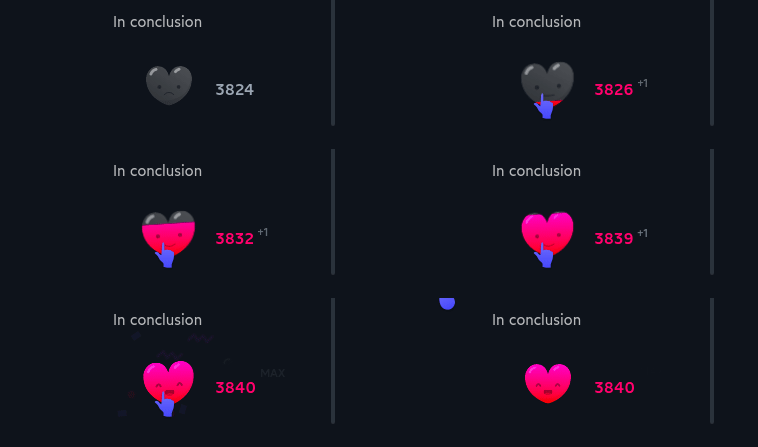
We all love the minute but highly engaging feedback we get when we do small things like liking a tweet, typing a wrong pass code on iOS, or for the Josh Comeau fans out there, liking his blog post. These microinteractions make the experience of using an interface much more appreciable.

Why the contextual button?
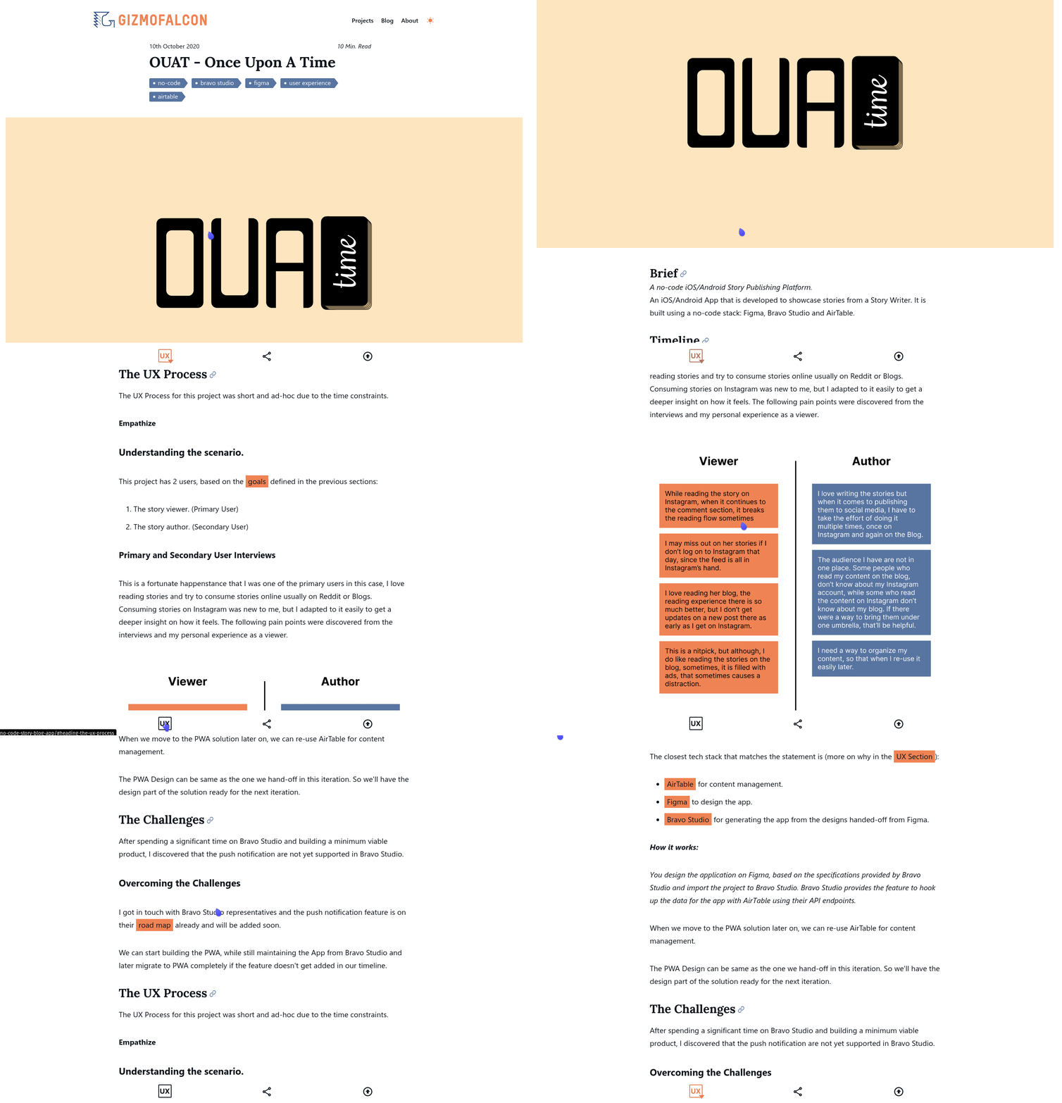
I wanted to implement a microinteraction on my website. Particularly, on the project viewing page. Not without a reason though. I wanted to have a way for the visitors to skip to the UX Sections of the projects. The reason being that, this website serves me with two purposes, it acts like my blog and my portfolio. So whenever I apply for a UX Job, if the recruiter happens to be viewing my projects, which mostly contain both technical and UX Process involved in the project, the recruiter may get confused seeing the technical information being presented and may get misled to think that I am only a tech person. To avoid such a situation, I wanted to give a heads up that UX section is down in the project and you can either skip to that section by pressing a button or read the whole content.
Why didn't I just re-organise the project structure?
Well, I had already drafted multiple projects in this way and for every project, I usually follow the same structure. So, this option was not feasible for me.
For the design, I iterated it twice:
Having a sticky bottom bar that says directly "Skip to UX Section"
This was functionally good but didn't give a good feedback for the viewers. It was also taking up more space, since I could add much needed features like back-to-top button and share button in that space if I use icons instead of plain text.

Having a sticky bottom bar that has relevant icons instead of plain text
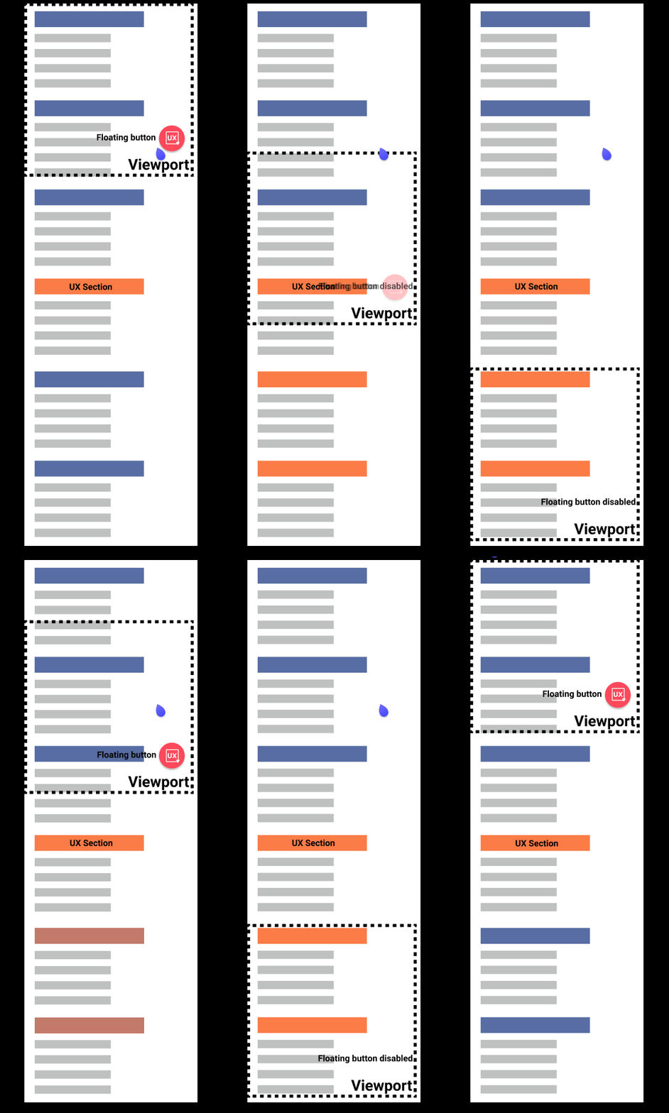
Here the "Skip to UX" button is no longer a text, but an icon, that pulsates when not in the UX Section and becomes static when in the section.
Also, it has a little downward pointing arrow in the icon to convey that the UX Section is coming up, below and the arrow disappears when you enter the UX Section.

The JavaScript
let options = {rootMargin: "0px",threshold: 0,}let callback = (entries, observer) => {entries.forEach(entry => {if (entry.boundingClientRect.y <= 1) {// inside ux sectiondocument.querySelector("#skip-to-ux").classList.replace("s2ux-out", "s2ux-in")} else {// outside ux sectiondocument.querySelector("#skip-to-ux").classList.replace("s2ux-in", "s2ux-out")}})}let observer = new IntersectionObserver(callback, options)let target = document.querySelector("#heading-the-ux-process")observer.observe(target)
Intersection Observer API according to MDN:
The Intersection Observer API provides a way to asynchronously observe changes in the intersection of a target element with an ancestor element or with a top-level document's viewport.
To simplify and put it in the context of this article, Intersection Observer API, provides the browser a way to track where exactly in the page is the viewer with respect to the viewport, so that it can decide on what version of the UX Button can be shown to the user, based on our logic.
The Intersection Observer constructor function takes two arguments a callback function and an options object.
let observer = new IntersectionObserver(callback, options)
Once the Intersection Observer object is created, it must be told to observe certain element(s) in the DOM. This is done using the observe method on the Intersection Observer object that was created. You can observe multiple DOM elements by calling observe method with different target elements.
let target = document.querySelector("#heading-the-ux-process")observer.observe(target)// observer.observe(target2);// and so on.
The callback function is where we write the logic on what should happen when the observer "sees" the target element or when it doesn't "see" the target element. In this example, I am swapping css classes based on if the element is visible or not.
let callback = (entries, observer) => {entries.forEach(entry => {if (entry.boundingClientRect.y <= 1) {// inside ux sectiondocument.querySelector("#skip-to-ux").classList.replace("s2ux-out", "s2ux-in")} else {// outside ux sectiondocument.querySelector("#skip-to-ux").classList.replace("s2ux-in", "s2ux-out")}})}
In the callback function you can see that it gets two parameters passed by the observer:
- The
entriesparameter is a list of entries corresponding to each target element for which the observer registered a change in its intersection status. - The second parameter is the
observeritself. Thisobserverobject can be used for example when you don't want to observe a target element anymore once the callback is called. To do that you would call theunobservemethod along with the target to "unobserve" as the parameter.
The options object helps you customize the observable area that the observer needs to observe. The options object can have the following properties as mentioned by MDN:
- root: The element that is used as the viewport for checking visibility of the target. Must be the ancestor of the target. Defaults to the browser viewport if not specified or if
null. - rootMargin: Margin around the root. Can have values similar to the CSS
marginproperty, e.g. "10px 20px 30px 40px"(top, right, bottom, left). Defaults to 0. - threshold: Either a single number or an array of numbers which indicate at what percentage of the target's visibility the observer's callback should be executed. If you only want to detect when visibility passes the 50% mark, you can use a value of 0.5. If you want the callback to run every time visibility passes another 25%, you would specify the array [0, 0.25, 0.5, 0.75, 1]. The default is 0.
let options = {rootMargin: "0px",threshold: 0,}
The above object would give us an observer, that watches the viewport of the browser, with no margins and 0 threshold, which means when a single pixel of the target element is visible, the callback is triggered.
After implementing this in my projects page, here is how it looked in action:
