Tentrr.com — Usability Evaluation
May 10th, 2022
5 minutes
Tentrr.com is a campsite booking website with over 1000 campsites spread across the US. It features an advanced filters and maps functionalities to find the right campsite for the users' needs.
We segmented the users of the website by referring to the Annual North American Camping Report and the features that the website offers. We realized that the relevant users of the website can be categorized as a new user, a returning user (experienced with camping and uses the website frequently) and also a campsite owner. We created personas so as to use them as a reference for the later stages of the test.
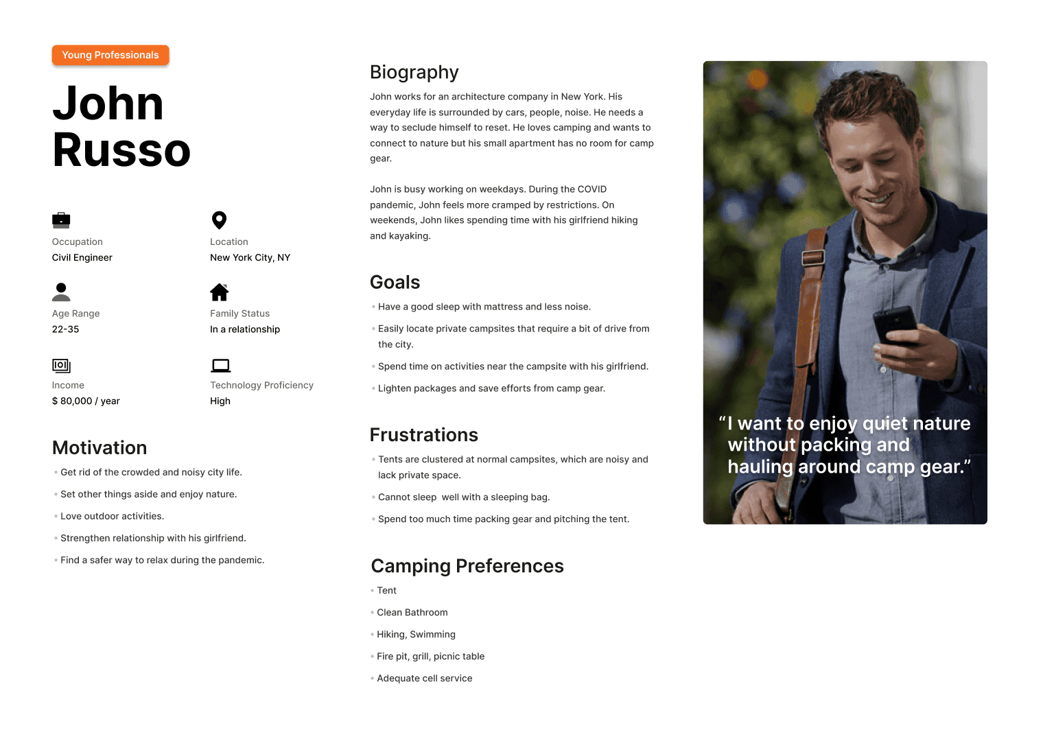
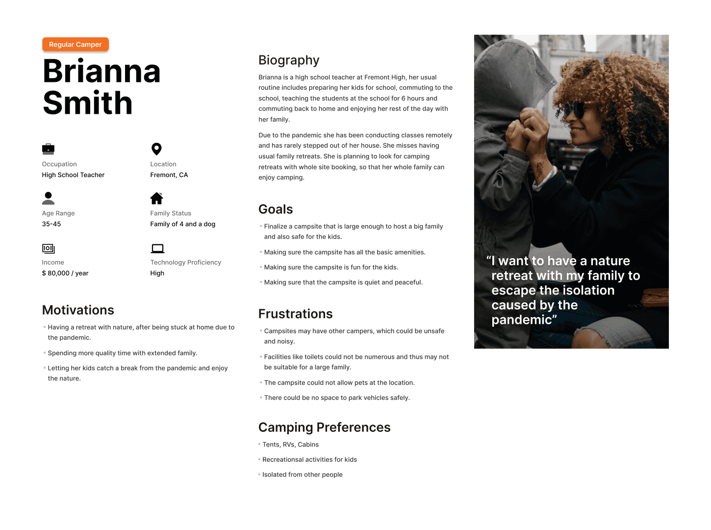
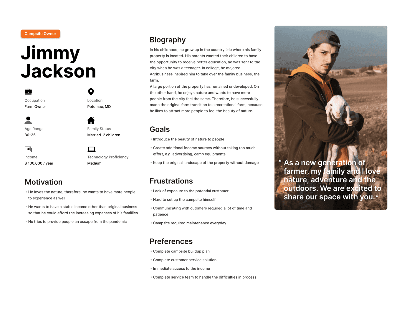
We evaluated the usability of Tentrr.com with a perspective of a new user, a returning user and as a campsite owner to test the interfaces the website offers to handle different scenarios like discovering campsites, booking a campsite and listing a site. We also performed heuristic evaluation to come up with ideal recommendations to improve the experience.
Heuristic Evaluation
We used Jakob Nielsen's 10 general principles for interaction design to perform the heuristic evaluation of the website. Here are some of the peculiarities that we found out during the evaluation.
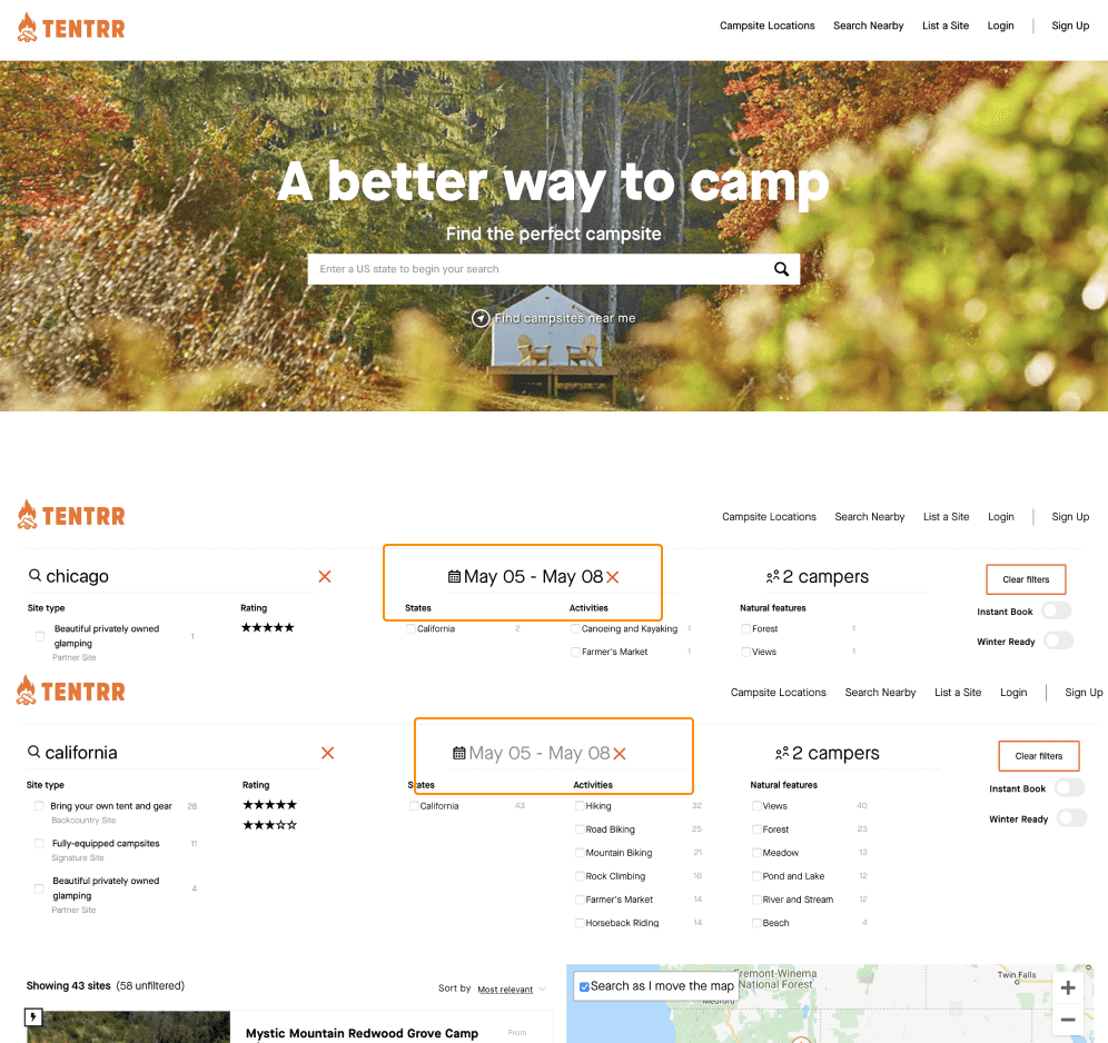
The cross button is to clear the dates filter, but it gives the impression that the dates selected are not available.
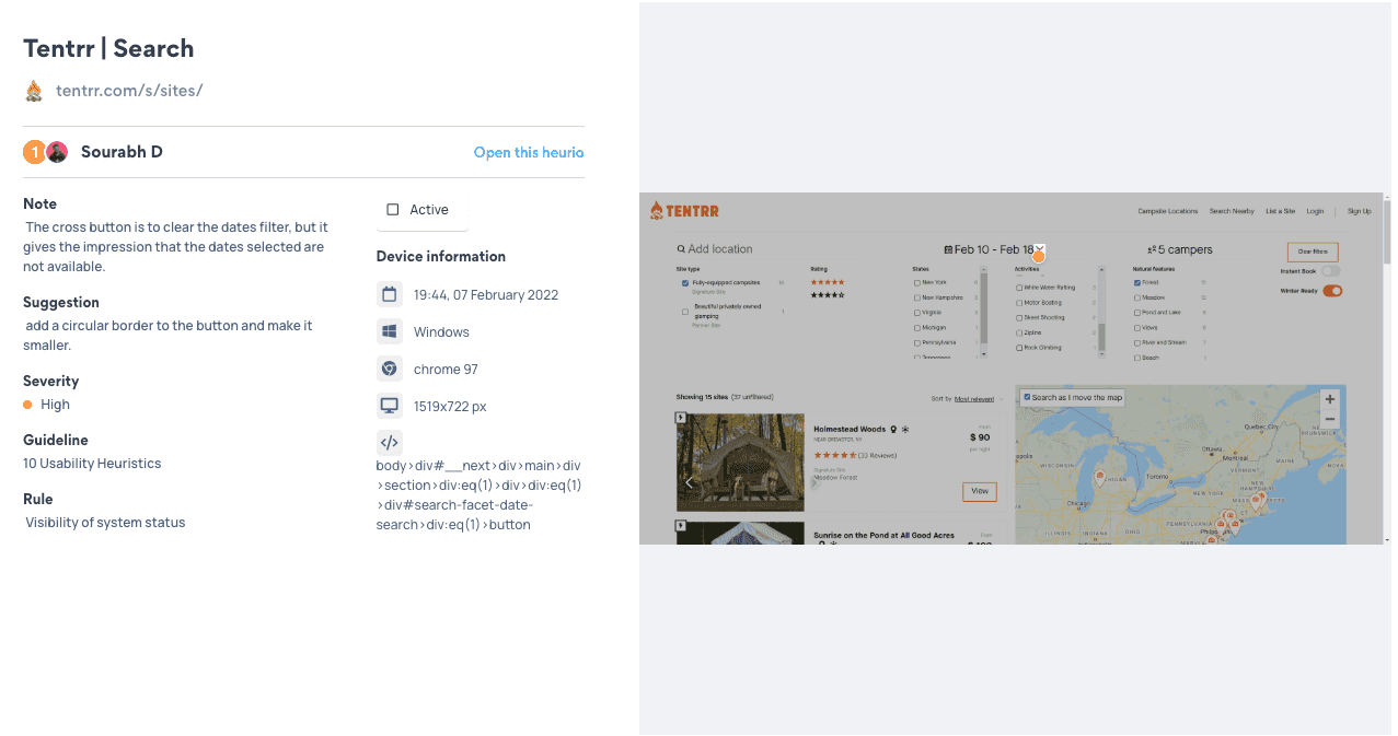
Suggestion
Add a circular border to the button and make it smaller.
The carousel controls appear to not be logically connected with the carousel.
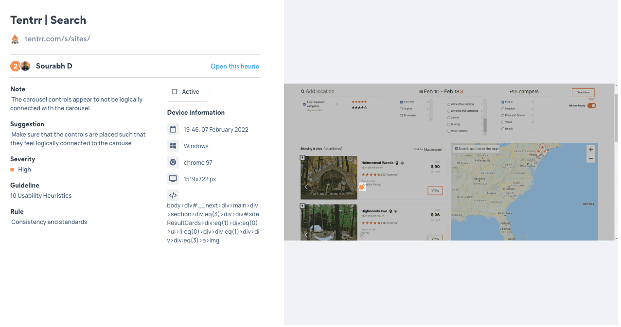
Suggestion
Make sure that the controls are placed such that they feel logically connected to the carouse
The text is confusing, it says unfiltered even after applying the filters. Which gives a wrong information of the system status
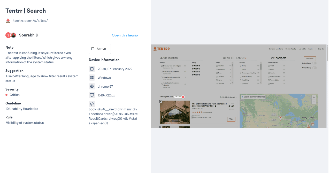
Suggestion
Use better language to show filter results system status.
These numbers without a proper label make no sense to the user.
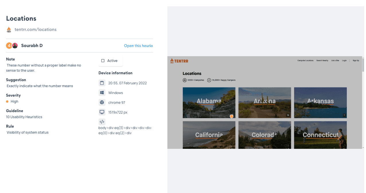
Suggestion
Exactly indicate what the number means.
Apart from the problems discussed above we found out other problems which were not as severe which can be accessed on the complete report.
Usability Testing
Methodology
We conducted 1 in-person moderated usability test and 2 hybrid moderated usability tests which involved a moderator and two observers. The test ran for around 30 minutes and started with icebreaker questions, followed by the tasks and closing questions. We also collected usability survey metrics to calculate the overall rating by the users.
Timeline

Our first week included preparing the test script for the usability test, recruiting the participants, preparing moderation guides and dry runs to correct any discrepancies in the test flow.
In the second week we conducted the usability tests and compiled the data we gathered on a shared workspace.
In the second week we conducted the usability tests and compiled the data we gathered on a shared workspace.
Findings
From Icebreakers
In the second week we conducted the usability tests and compiled the data we gathered on a shared workspace.
- Campers have vividly different camping preferences when trying to book campsites online.
- Users do not use a go-to platform to find campsites, they just find campsites by googling.
- Some people associate camping not only as a getaway from the crowd, but also events like a music festival.
- Users consider prices of the campsite as an important factor when it comes to booking campsites online.
Quantitative Analysis
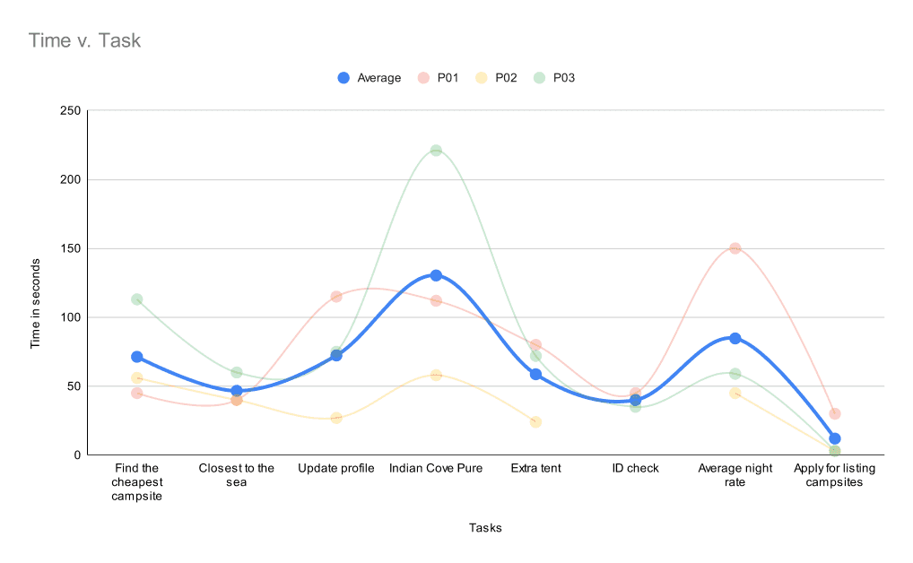
We observed that users found it hard (and failed as seen from the next slide) to complete the “Indian Cove Pure Gold” Campsite.
This was due to the filters being retained from the previous task without the user’s knowledge.

We also observed that the task which involved panning/zooming around the map to find campsites was not successfully completed by the participants, while they thought they completed it successfully.
This reveals to us how this feature misleads the users by giving ambiguous results.
Minor Usability Issues
- Profile edit function: On the profiles page, users felt they could readily edit the profile details.
- Age checking pop-up: The age verification prompt is misleading. It says “We need to check your ID”.
- Website menu design: “Account” and “Profile” as different sections confuse the user.
- Filter design
- Wording: Words used in the “Site Type” filter are confusing to the users.
- Option: The user expected “price” to be a part of the filters.
- Information architecture - “Become a CampKeeper” page:
- The important information related to the benefits does not display in the obvious section.
- The campsite listing pages need sections like testimonials to add more authenticity.
- Map feature: It doesn’t show campsite locations around all regions of USA when zoomed out, biasing the judgment of the user.
Major Usability Issues
- Information architecture - campsite intro page: The amenities section looks too generic and is misplaced
- Filter: The lack of the “Apply Filter” button confused the user on if the filters were applied or not.
- Search box: The placeholder text on the homepage asks to enter a state, but the user could enter anything and it works.
- Map Feature: The map shows different campsites at different zoom levels.
- Filter:
- Dates are pre-filled on subsequent visits to the homepage.
- Having no date selection on the homepage confuses users on the pre-filled dates.
- Search box: The search results omit campsites that are unavailable on the given dates.
Analysis
All participants failed to use the map feature
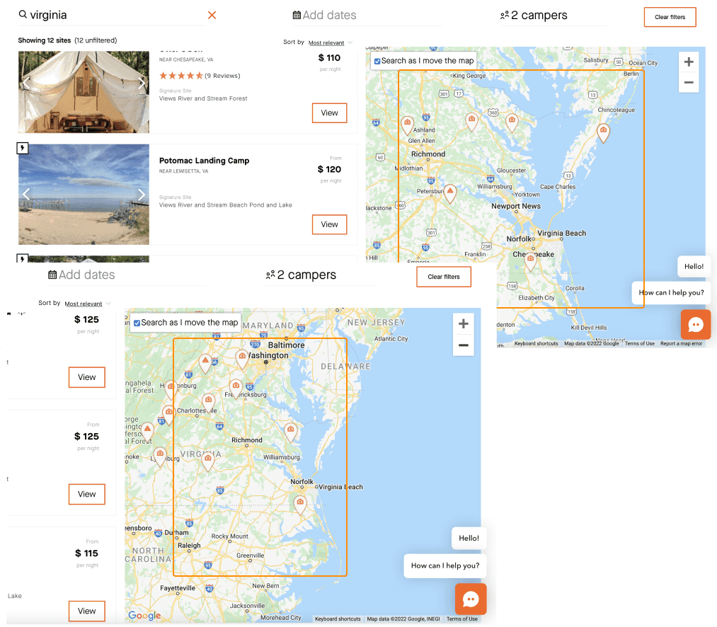
All participants failed to use the map feature to locate the campsite closest to the sea. (Although one participant performed the task as intended)
The map shows different campsites at different zoom levels. Users might not end up with the desired campsite by using the map.
Recommendation
A google maps like behaviour in which the pinpoints on the map stay consistent when zooming in/out.
All participants failed to find a specific campsite
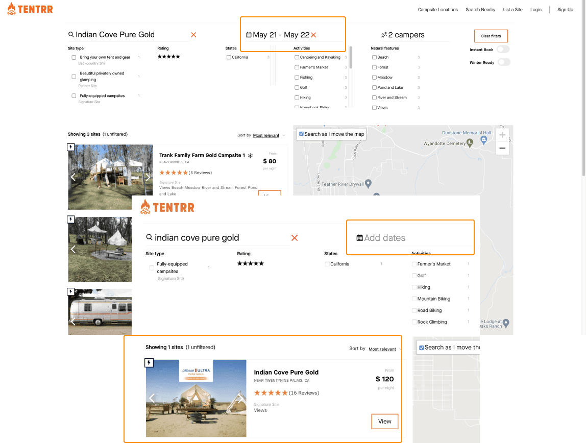
All participants failed to find a specific campsite by searching the campsite’s name. They all assumed they did an incorrect search.
They did not realize the campsite is unavailable during the selected dates, because the website does not display any unavailable campsites in the search results.
Recommendation
Graying out the unavailable options and not omitting them from the results would convey the right message to the users.
Lack of selections for dates and the number of campers on the homepage search
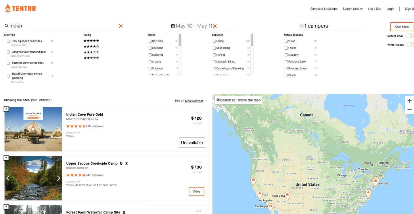
Another factor leading to the misunderstanding is the lack of selections for dates and the number of campers on the homepage search.
Some participants assumed that the filters would reset with a new search from the homepage.
When redoing the search from the home screen, the previously used dates would kick in and also turn from black to gray, which is even more unnoticeable to the users.
Recommendation
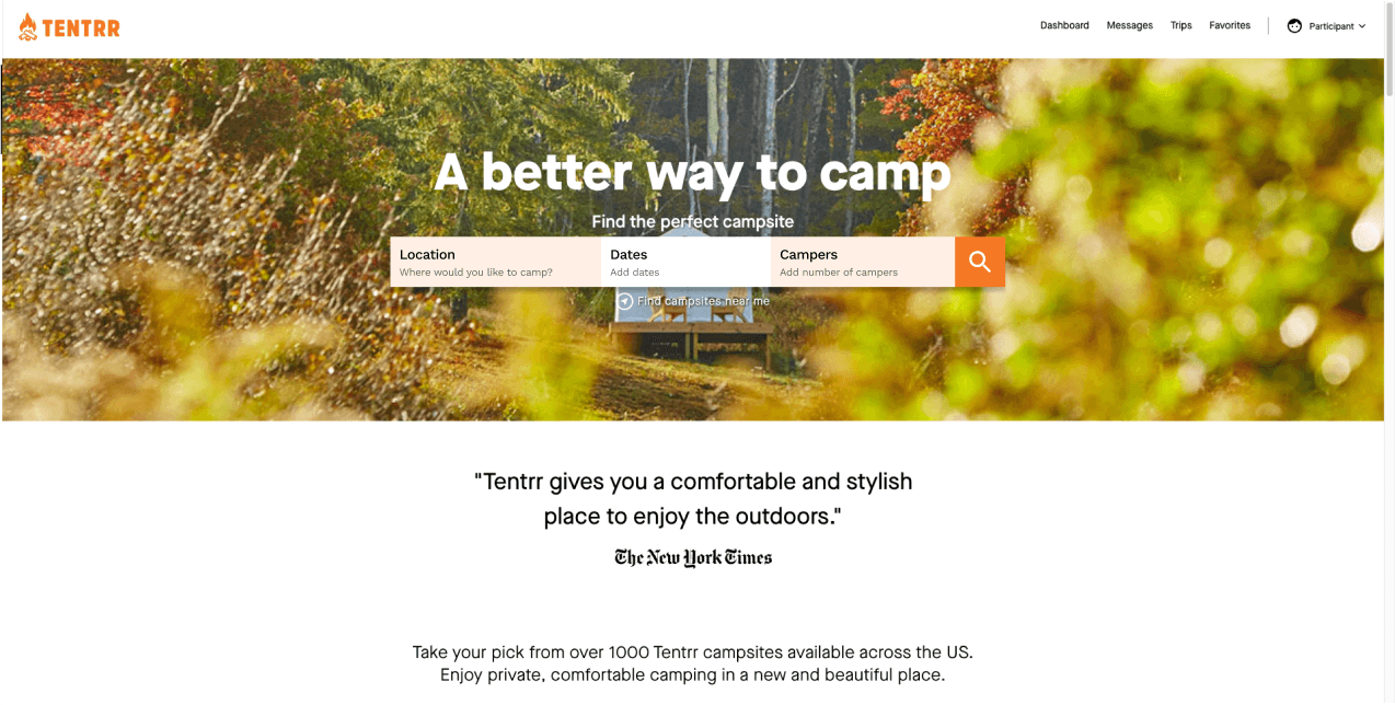
Adding the basic filters on the homepage would indicate the users on what the status of those filters are when they revisit the page and also helps search for campsites better even before going to the results page.
Final Evaluation
SUS Evaluation

The final SUS score is 65.83 which is not ideal, indicating that improvements need to be made on the website.
Key Recommendations
Based on the usability test results, including both quantitative and qualitative data collected, we should prioritize these three parts of the website for improvement.
Filter Feature
Filter functions should be clear and match users' expectations, such as a clear indication of the filter usage or categories of filters. Additionally, on the results page, after applying the filters it should also show results that were filtered out.
Search Feature
Homepage’s search feature seems to be not well-defined, leading to confusing results to users. It should consider adding constraints such as location suggestion, date etc.
Map Feature
Map function should provide more accurate and consistent results for users. Users who use the maps feature usually would be on a hunt to find their ideal camping location.