MuscleWiki — Usability Evaluation
November 24th, 2021
20 minutes
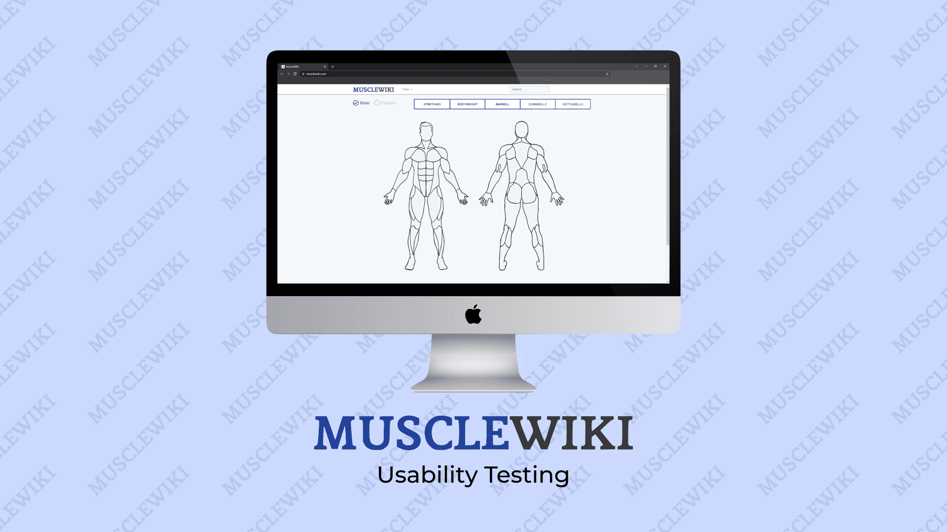
I have been in the fitness journey since 5 years and I discovered MuscleWiki website around two years ago when it started being referred to a lot in the fitness communities of Reddit. I use it as a reference whenever I start with a new exercise and also to calibrate my diet. Even after using it for 2 years I still see several parts of the interface which are too confusing and some of the content on the website not being easily accessible.
I feel that the website has a lot of valuable information and tools to offer but is unable to do so due to the current interface and information architecture. The tools offered by the website is very helpful because they are offered under a single umbrella but currently, they have a somewhat convoluted interfaces which has resulted in me having to abandon and go to different websites for each tool.
This website also has information about the mechanics of muscles, which is very important when learning about mind-muscle coordination, an important part of learning an exercise. But this information is buried so deep that it appears non-existent to a new user. These are the reasons why I would like to uncover the problems with the tools interfaces and the information architecture of the website with this project.
User Demographics
The MuscleWiki website will be typically used by professional body builders, calisthenics athletes, general fitness enthusiasts and the people who are starting out with their fitness journey.
The typical users are generally aged anywhere between 18 to 44 years. Since that is the general demographic of people who are most likely to exercise (Rhoades, 2005).
This website’s users typically have at least basic computing experience like knowing how to use a browser and access websites on the internet. Some familiarity with the terminologies used in the fitness community is necessary. This includes knowing the terms like reps, sets, macros, calories etc.
Common tasks a user would perform
The users of this website would commonly use the website to explore new exercises when they are planning their routines, learn more about the muscles involved in an exercise, learn about the mind-muscle coordination, check their form for an exercise (with the video GIFs) at the gym, calculate their daily calorie intake to help with their fitness goal, calculate their macro-nutrient intake to eat the right kinds of food, calculate their safe one-rep max to prevent injuries caused by using heavier weights and sometimes to sign up for the newsletter to get updates about the content added to the website.
With that context, the tasks of the unmoderated usability test and the heuristics evaluation are focused on accessing the exercises and muscle information pages along with the use of the fitness tools like the calorie calculator provided by website.
How tasks were chosen for inclusion in the task list
The fitness community believes that diet and exercise go hand in hand to get fit. And the tools on this website help for the diet part of the equation while the exercises listed on the website helps with the physical exercises. So to evaluate the crucial parts of the website, the tasks must include both: accessing exercises and exercise tools and using the diet tools.
The tasks list was curated in a way how a typical user gets introduced to fitness and the website, starts using the website. The user would commonly be referred to the website from a friend or from online fitness communities, when they ask about how to begin their fitness journey. So the tasks list initially focuses on exploring exercises. Later the tasks focus on using the diet tools, followed by a muscle exploration task. This is followed by a task that involved using the one-rep max tool, which is used in intermediate exercise programs. The tasks list also is sprinkled with general tasks like signing up for a newsletter and checking the copyright page, to holistically cover the entirety of the website.
The tasks list was tested with 2 friends.
Tester A: Male, Graduate Student, 20-25, little experience with fitness, competent with computers.
I conducted this test with a user with little to no experience with fitness, to unravel parts of the tasks list that were too arcane. This test revealed that some of the terms used in the task list were confusing. I fixed some parts of the task list and later realized that I cannot target the usability test of this website to beginners because some of the tasks require some knowledge of the terminologies that users learn over time with their fitness journey.
Tester B: Female, Engineer, 20-25, significant experience with fitness, competent with computers.
The updated tasks list was tested on a user with significant experience in fitness to see the coherence and the flow of the tasks and to unearth some issues in the tasks list that only an experienced fitness person would be able to catch. This led to some interesting fixes like providing more context with each task.
Scenario
You have decided to get back in shape. You reached out to your gym-bro friend to help you out. He told you that you have to focus on both, your diet and exercises to become stronger. He sent you the link to the website you are about to test and informed that it can help you with both of those aspects. He tells you to start light and not to forget to stretch before exercising.
You decide to plan your weekly exercise routine. With COVID still around you decide to start exercising at your home without any equipment.
Tasks List
This is the updated tasks list that was curated after running it by the 2 testers described above.
The list starts with basic tasks that involve looking up exercises on the website.
- Use the website to browse for bodyweight chest exercises. Name two beginner friendly bodyweight chest exercises.
- You remember that you should stretch before exercising. Look for chest stretching exercises. In the first chest stretch exercise, at what angle should you place your arm against a raised wall?
The list then delves into tools usage. These tasks are framed to unearth the issues in the interfaces of the tools offered by the website. Task 5 which requires users to use the provided data to calculate the daily calorie needs was framed to reveal what a user using a mixed system of units (metric and imperial) would do with the interface to complete the task.
- You remember that you should also focus on your diet. Look for tools that the website offers. Name 2 tools the site offers that help with your diet.
- Use the relevant tool available on the website to calculate your daily calorie needs. How many calories would you have to consume everyday?
- Out of curiosity, you decide to see how many calories Dwayne “The Rock” Johnson would have to consume if he works out once everyday to maintain his weight (Height: 6’5”, Weight: 130 kg, Age: 49 years, Gender: Male). How many calories does he have to consume everyday?
- You decide to follow a low carb macro diet. Use the relevant tool available on the website. How many grams of carbs can you eat per day if you follow a low carb diet?
This is followed by a task that involves discovering a page, this was added to the list to test how buried some of the pages on the website are.
- You want to know more about the mechanics of biceps muscles. Look up about the biceps muscles on the website. Which of the two heads of a bicep is responsible for curling motions?
The next task was to test the use of the word “directory” for the link to list of all exercises and also to test the discoverability of the link which was hidden under tools dropdown menu
- Go to the page on the website which lists ALL the exercises. What is the 3rd Lats Exercise listed on the page?
The following tasks consist of secondary aspects of the website (10, 12) and were added to holistically cover the pages of the entire website. And also a tool usage task (11) is added that requires some fitness knowledge that a person acquires over time in their fitness journey.
- Try signing up for the newsletter of the website with the email address: todib47938@incoware.com, First Name: Jon, Last Name: Doe. What does the website say?
- You have been working out for a few months now. Your friend tells you to follow a workout program that requires you to calculate your “one-rep max”. Use the tool available on the website. What is your one-rep max if you can do 8 reps with 25kg weight?
- Look about the copyright policy of the website. What’s the email address you should reach out to get permission to use the content?
About the usability testing
The remote unmoderated usability test was conducted between 18th November 2021 and 20th November 2021, with 6 users. After testing the tasks list with 2 testers as explained in the previous section, it was clear that the ideal way to choose users for this test was to ask for the user’s proficiency with fitness. I reached out to my friends who I knew were into fitness and made sure they are at least an advanced beginner (U2, U6) in their fitness journey, with mostly proficient participants (U1, U4, U5) and there was also an expert participant (U3) in the mix. This was essential because, some of the parts of the website used in the tasks list needed some knowledge with the terminologies used in the fitness domain.
Apart from the fitness experience parameter, the general parameters were flexible, but due to the constraints of time and resources, the users who were selected were from my friend circle and thus their age ranged between 21-26 years, everyone had at least a Bachelor’s degree, and were mainly graduate students (U1, U2, U3, U5, U6) with an exception of a software engineer (U4). Everyone were proficient with using technology. While most of the participants identified as male, one identified as female (U6).
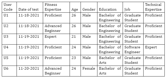
The users selected make up a subset of the actual users of the website. The actual users of the website range from absolute beginners to experts of fitness. For this usability test, I had to not involve absolute beginners because some tasks of the usability test would require the users to know about the terminologies used in the fitness community. And this was revealed when I tested the interface with a beginner as mentioned in the previous sections. The age range of the the typical users of this website will also be wider than 21-26 years, around 18 to 44 years (Rhoades, 2005).
Results of the testing
Post Survey Responses
What was the worst thing about your experience?
| User | Response |
|---|---|
| U6 | No Response |
| U5 | Having to remember what my required calories were when I calculated my macros |
| U4 | Toggling between Imperial and Standard Metric. For example, I use KG to measure weight whereas Feet to measure my height. But the website allows only one Metric to use at a time. |
| U3 | The inaccurate calorie counter |
| U2 | No Response |
| U1 | No Response |
What other aspects of the experience could be improved?
| User | Response |
|---|---|
| U6 | No Response |
| U5 | That was all |
| U4 | The list of all exercises can be presented in a better way so that it is accessible from the homepage. |
| U3 | The list of all exercises should be more prominent |
| U2 | No Response |
| U1 | No Response |
What did you like about the website?
| User | Response |
|---|---|
| U6 | No Response |
| U5 | I like the was that you found exercises. Filtering by type then body part is an intuitive way to find exercises that fit your routine |
| U4 | The homepage where you can select the body part and got to its respective page. |
| U3 | The interactive body/muscle diagram |
| U2 | No Response |
What other comments do you have for the owner of the website?
| User | Response |
|---|---|
| U1 | No Response |
| U6 | No Response |
| U5 | No Response |
| U4 | The calculator tools can be a bit more interactive |
| U3 | Kind of boring aesthetically |
| U2 | No Response |
| U1 | No Response |
Individual User Performance Results
Task 1: Finding two beginner friendly bodyweight chest exercises
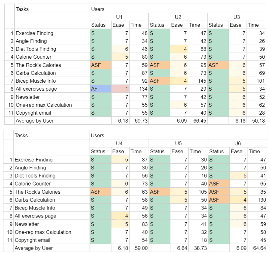
Every user was able to complete this task successfully. Although U4 took a significantly longer time than the other users (87s almost double the other users). This can be attributed to the user misunderstanding the task initially and later realizing the whole task. Apart from this anomaly, every user was quickly able to use the exercise filter bar and the interactive muscle map on the homepage of the website to complete the task.
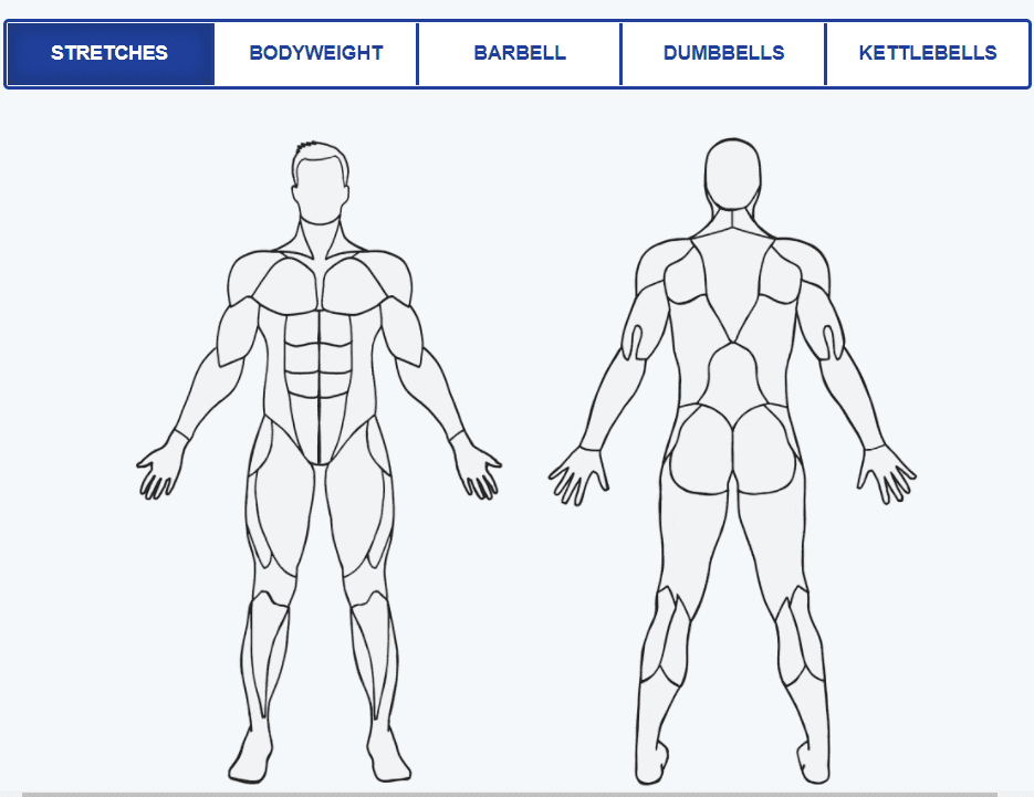
Task 2: Finding the angle of the arm against a raised wall for a chest stretch exercise
This task was completed successfully by all the users in relatively same time. A peculiarity here was that one user went back to the homepage to do this task (U5), while the others stayed on the same page and took the steps to complete the task (U1, U2, U3, U4, U6). The detour for U5 was caused by the user not associating the filters bar and the exercise page header together, resulting in them thinking that the filters bar here would give a different result.

Task 3: Finding the diet tools.
All the users were able to find the diet tools. All the users took some time exploring the website to find the tools. U2 took significantly more time than the others, this could be attributed to U2 still being an advanced beginner and not completely knowing the terminologies used in the domain. Even U6 commented on how a beginner might not know the terminologies and may find it hard to complete this task and rated a lower ease score (5).
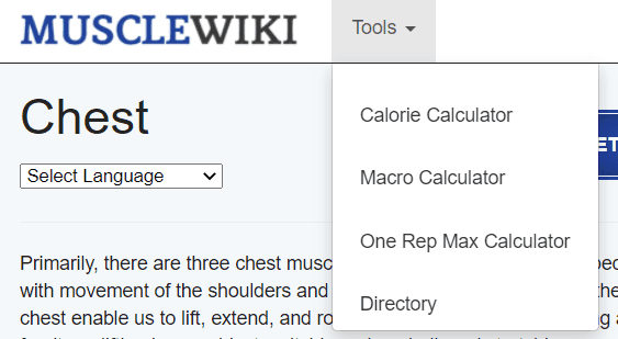
Task 4: Using the calorie calculator.
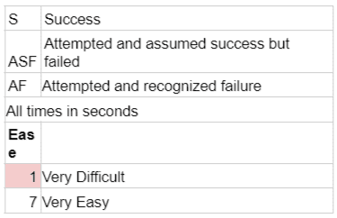
All the users except U6 were able to use the calorie counter and complete the task. All the users clicked the Calorie Calculator page and some (U1, U4, U6) struggled to use the knob inputs to set the values for the calculation. U6 attempted and assumed success while had missed out on setting the gender parameter of the calculator when putting in the data for the calculator. This is caused by the lack of order and association in the controllable elements of the calorie calculator interface.

Task 5: Using the calorie calculator with Dwayne Johnson’s data.
For this task, all the users attempted and assumed success while getting wrong results. This task revealed multiple problems with the calorie calculator interface. The reason for this is due to two reasons:
1. The data provided to the users in the task used mixed measurement systems (both metric and imperial) [Height: 6’5”, Weight: 130 kg, Age: 49 years, Gender: Male]. With this data, the users were confused initially when they saw the interface which portrays as if it supports either metric or imperial system of units at one time, while you can put mixed data by switching the units after entering each parameter.
2. Some users (U1, U3, U6) figured this out but ended up with wrong answers because the knob input on the calculator is too sensitive which led to different unit conversion values when they switched units.
Task 6: Daily Carbs Calculation
All the users except U6 was able to complete the tasks successfully (Although they had to put in roughly different daily calories than what they calculated previously, which is a potential recall problem which is later discussed). U6 attempted and assumed success but failed to do the task because, they were not able to put the desired calorie value in the field, due to the interface correcting the value.

Task 7: Information on Biceps Muscle Mechanics
All the users except U2 were able to complete the task successfully. Everybody took significant efforts to do this task. U2 failed to complete the task because they couldn’t reach the Biceps Muscle Page even after reaching an intermediate page that linked to the required page. The user was confused and answered from the data available on the intermediate page.
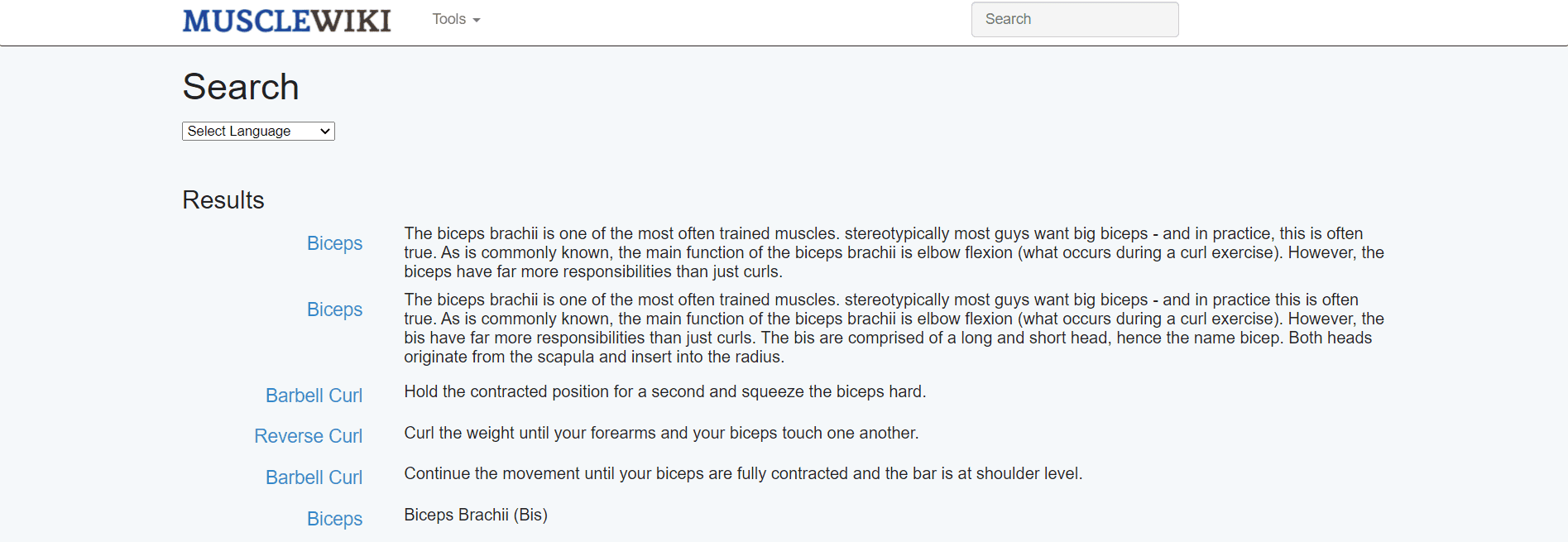
Task 8: Accessing the ALL exercises page
All users except U1 were able to complete the task. U1 failed to complete the task because they were unable to reach the page with all the exercises listed. The user did not connect the word “Directory” mentioned in the tools dropdown with “a page containing all the exercises” thus not reaching the desired page.

Task 9: Signing up for the newsletter.
All the users were able to successfully complete the tasks. Although users U1 and U4 struggled a little to find the link to the newsletter page by scrolling around for a while. One peculiar observation with all the users was that they tried to clear the preceding “spaces” in the email field when they pasted the email to sign up. There was no preceding space in the input fields.

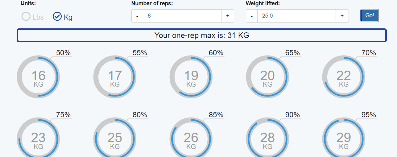
Task 10: One-rep Max Calculation
All the users were able to successfully calculate one-rep max using the one-rep max calculation tool, but they did not interact with the statistics of the results. Although it should be noted that the users of this test were selected by screening their experience with fitness activities, since the focus of the usability test was more oriented towards usage of tools and the website. A beginner may not be able to complete the task due to not knowing the terminologies used.
Task 11: Copyright policy check
All the users were able to complete this task successfully. The email was hidden in the copyright text, but the users were able to figure it out and complete the task.

Interface Problems discovered from the tests
Users not associating the filter bar and the page header
When performing the Task 2, users struggled for a couple of seconds to connect the dots: page header and filter bar work together. That is, if you are in the chest page and use the filter bar, it shows chest exercises that belong to that filter alone. Although the average task duration was relatively low (~34s), the recordings show this small de-sync in user action. U5 even ended up going back to the homepage and performing the task.
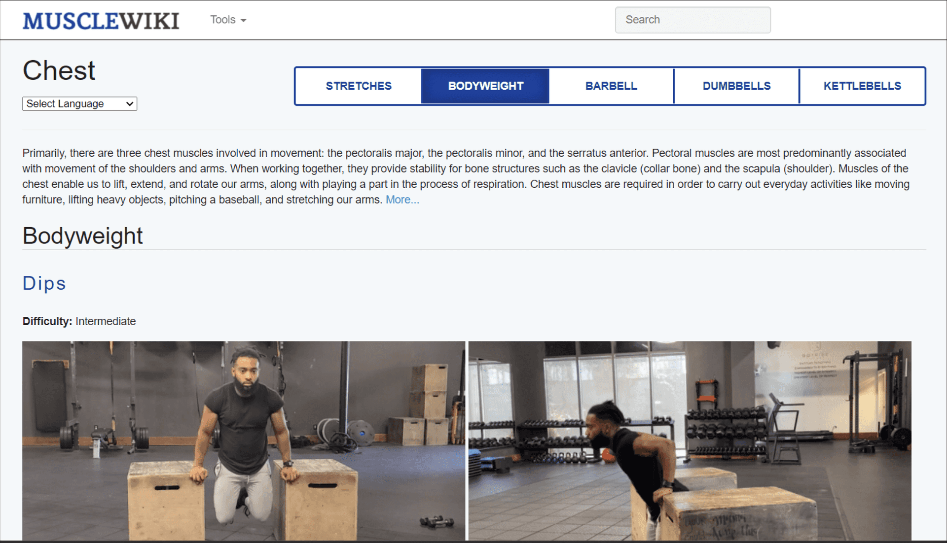
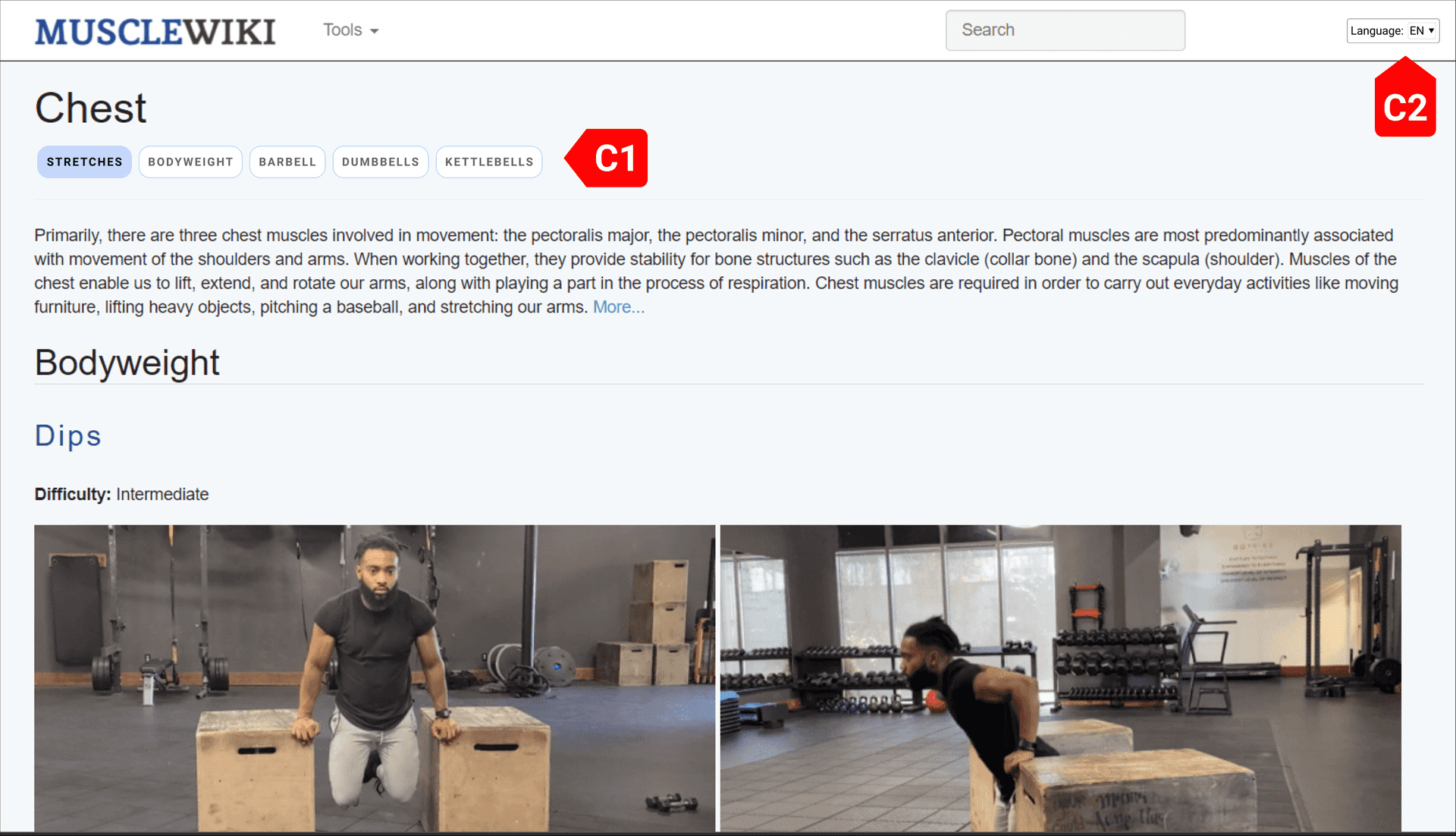
I have moved the language menu to the globally present navbar instead of having it within a page (C2). In the space below the page header, I have moved the filters bar, so that the users can easily connect the two and understand that the filters on this page will show content relevant to the page header alone.
Using the knobs and controls of the calorie counter is hard
When users were performing the tasks 4 and 5 it was clear that the arrangement of the controls and the knobs interface of the calorie counter was too confusing and giving erroneous results, which is the reason why every user doing the Task 5 failed because some ended up calculating wrong values due to the sensitivity of the knob input. Also, when doing the task 5, since the provided data was a mix of both metric and imperial units, some users used external tools to convert the input (U4, U5).

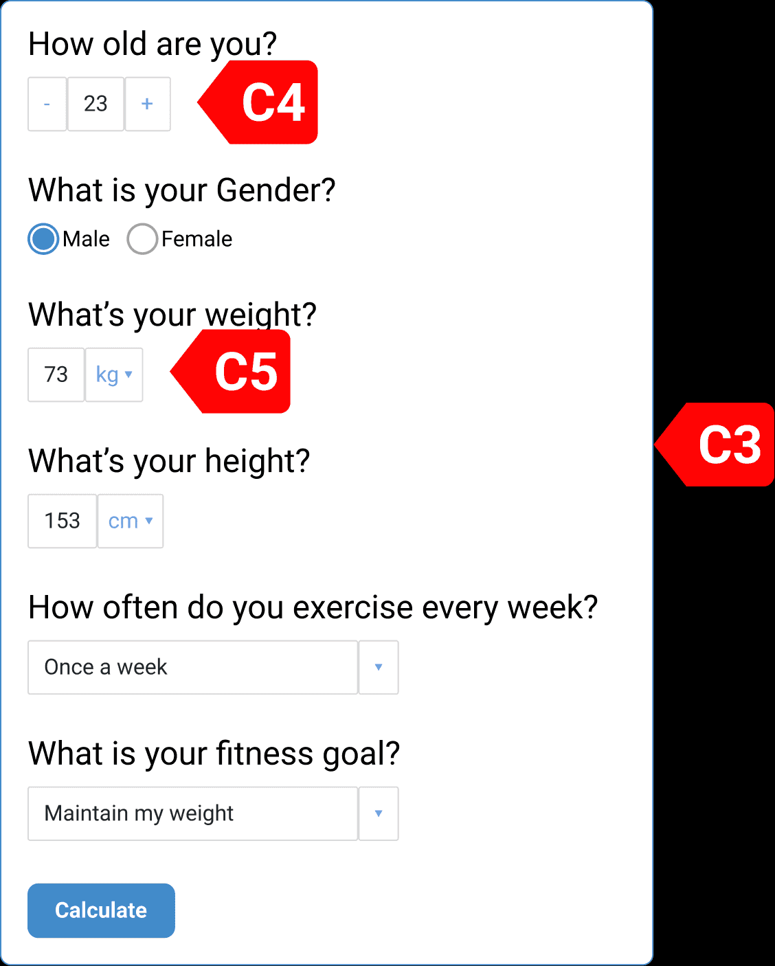
As seen in the after picture, the new interface (C3) has an order of form elements. I have removed the knob input interface to fix the ambiguity in the input data and added independent unit conversion options (C4, C5) to make sure the user doesn’t have to worry about unit conversion when using the tool.
When users were performing task 6 it was revealed that the input field for calories does not carry forward the daily calorie value calculated in the previous tasks. That is, the users had to remember their daily calorie intake value that was calculated to use the Macro Calculator. And moreover, it also rounds off the value to the nearest 0 or 5 thus giving inaccurate results.

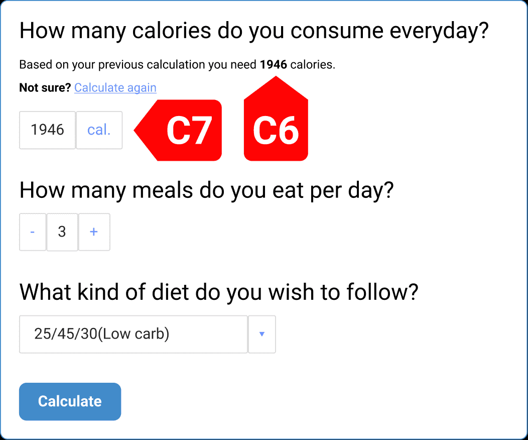
The new interface now shows the calories calculated with the calories calculator (C6) and links the user back to the calorie calculator if they are not sure. Also, the input field does not round off the calorie value that is put in.
It was hard for the users to get to the Biceps Muscle Description Page
All the users except U2 were able to do this task, but still every user struggled with the task since there was no one go-to way to do this task. Everyone either used the search bar and in the search results choose one of the 2 identical results or landed on the exercise page of the biceps and discovered an inconspicuous link in the text.
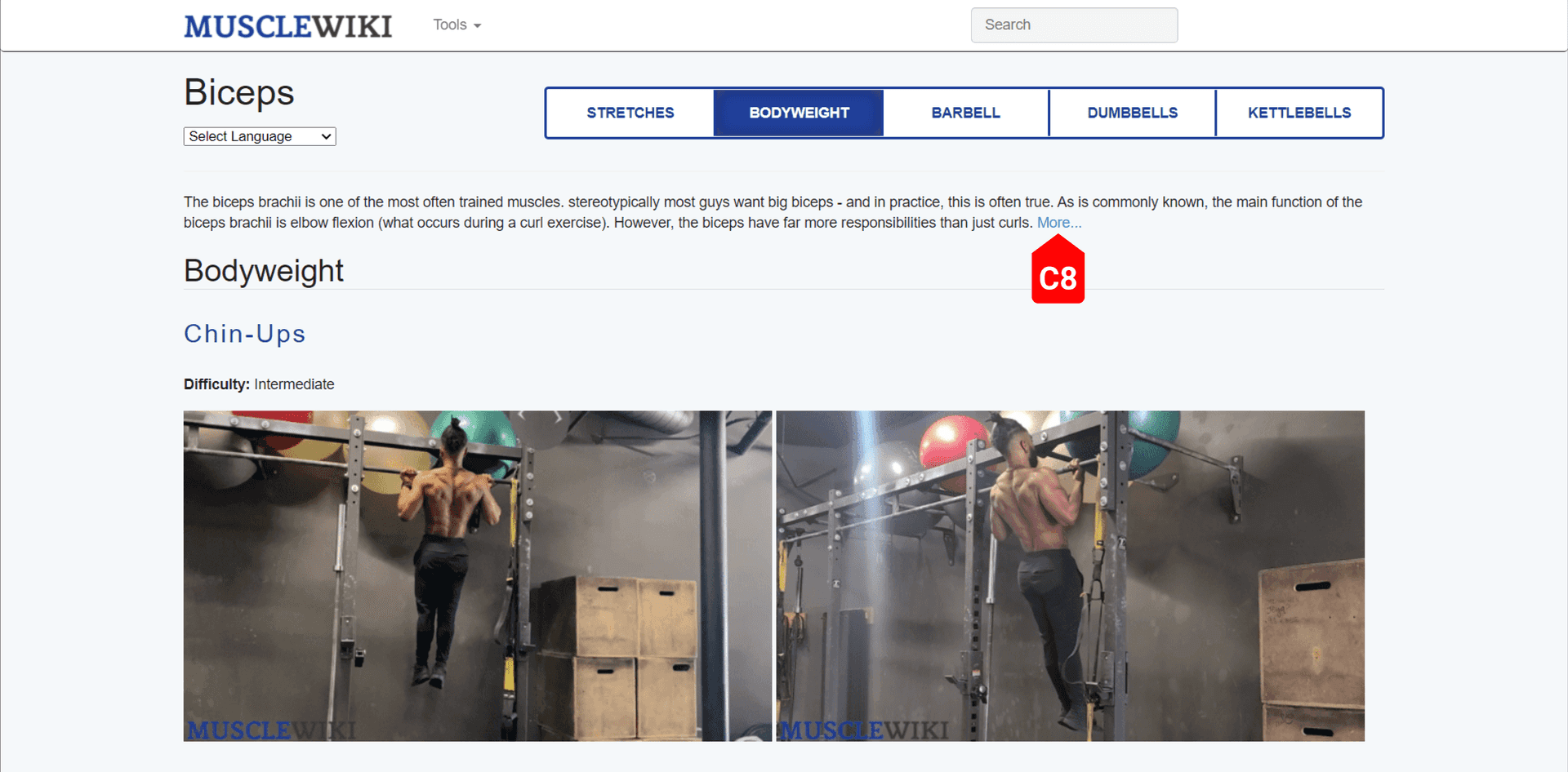
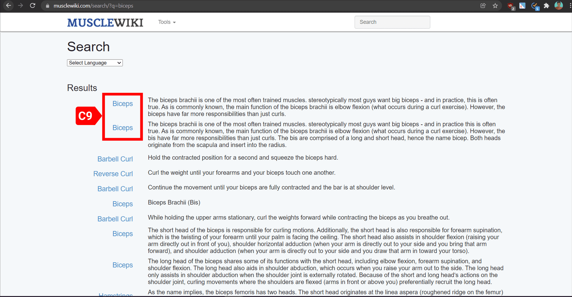
As seen in the images, the link leading to the muscle description page from the exercise page can’t be recognized easily (C8) and the search results page show more than 2 results with the same title and the 2 marked with the box have the same content, further confusing the user (C9).
After:
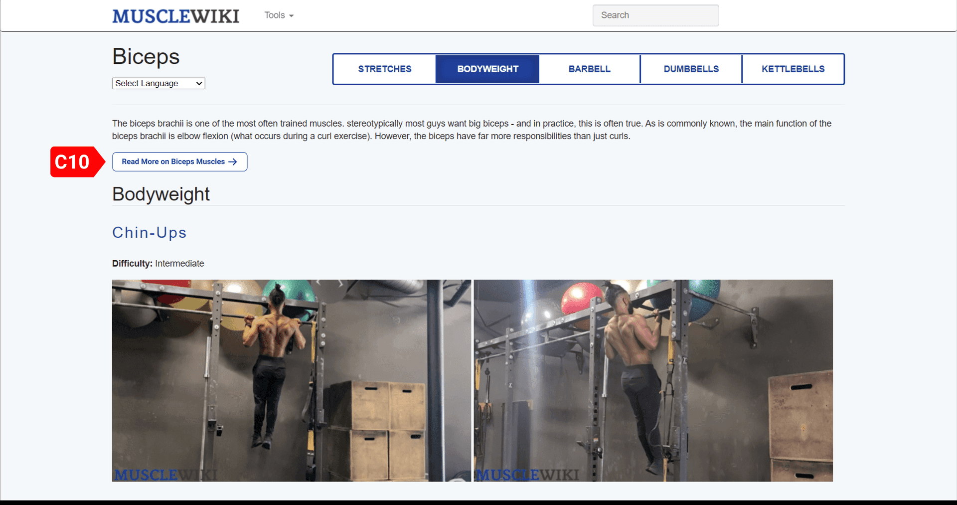
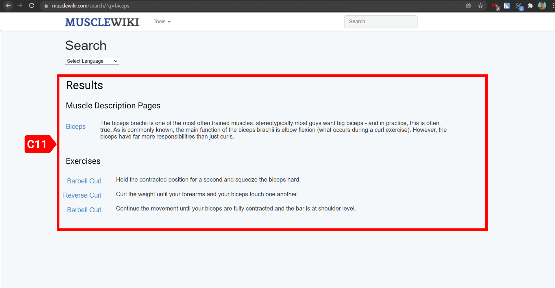
Having a clear button that informs that the users can use to button to reach the biceps muscle page will make the user’s efforts simpler (C10). Categorizing the results and not showing repeated results will make sure that the user can confidently choose one of the search results to reach their desired page (C11).
Accessing the page with all exercises was hard
User U1 failed to make the connection between the word “Directory” with the phrase “A page with all exercises”. This is because the word directory feels too generic and conveys ambiguous meaning to the users (C12).
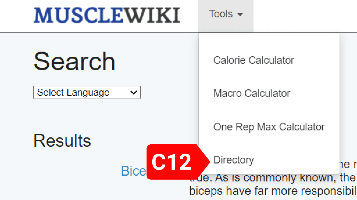
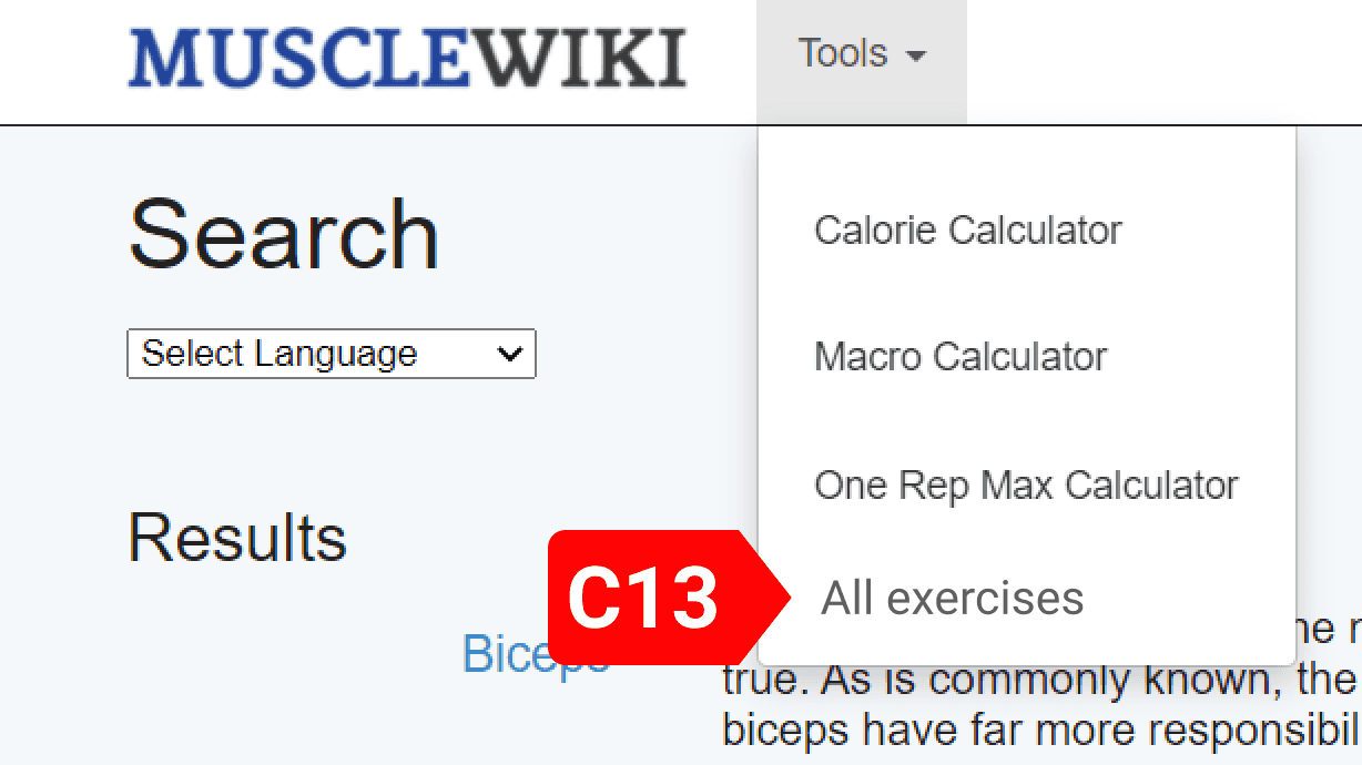
Using a better phrase “All exercises” in this context, conveys the meaning in a clearer way so that the users do not get confused (C13).
Reaching the newsletter sign up page needed useless scrolls
Users U6 and U4 struggled to reach the newsletter sign up page, because it was only accessible in the footer, and they were in all exercises page which had a ton of search result content stacked on top of the footer. So, they had to spend some significant time to scroll down to find the newsletter sign up link (scroll bar position in C14).
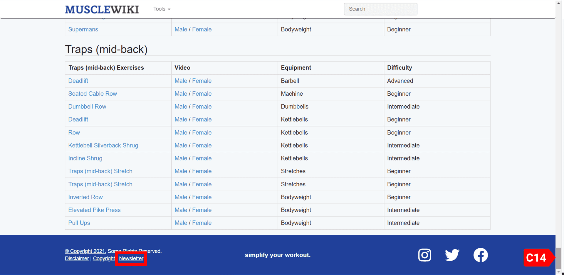
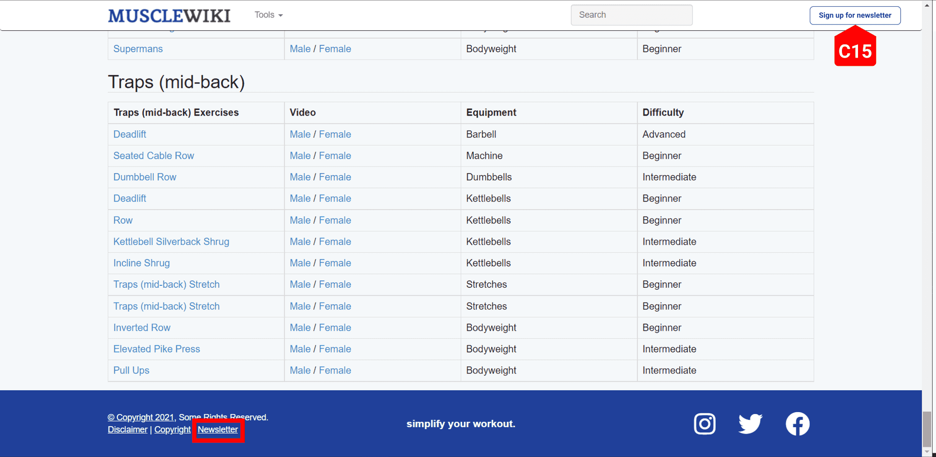
Along with having the link in the footer, having a button to sign up for the newsletter in the navigation bar would make is easier for the users to get to the newsletter page.
Users performed aberrant actions when signing up for the newsletter.
On the newsletter sign up page, all the users tried to delete the preceding spaces in the fields of the sign-up form (C15, C16, C17) and after filling the form got confused by the submit button thinking it was disabled (C18).
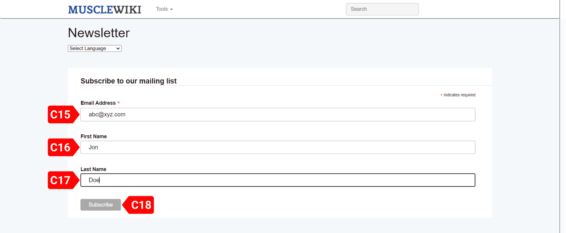
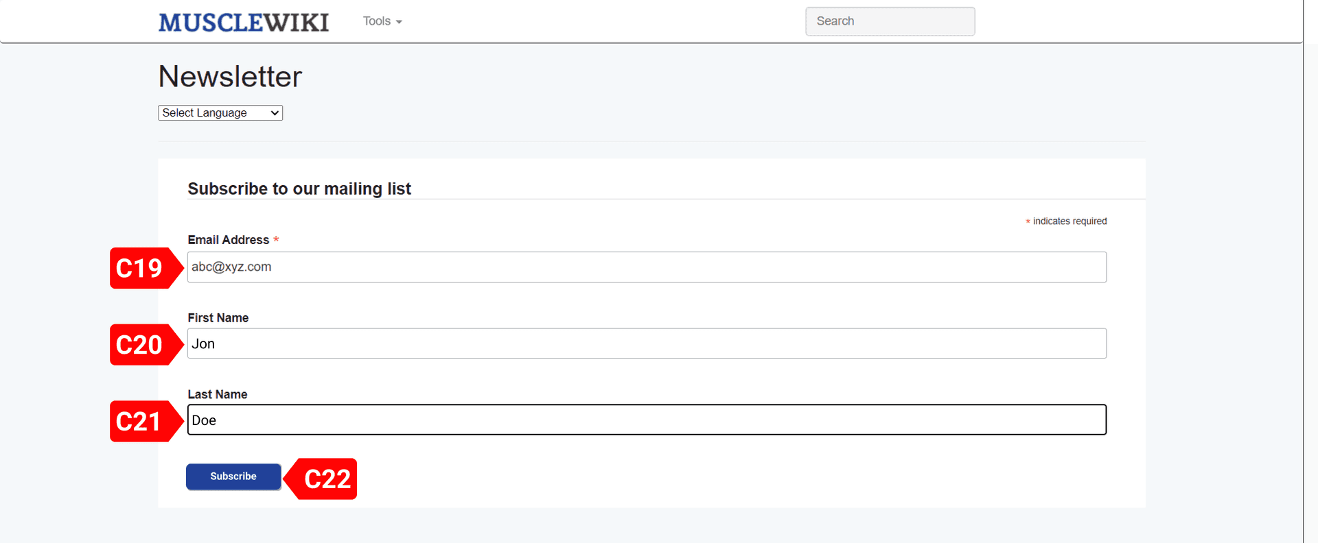
Reducing the left padding in each of the input fields will fix the issue of users confusing them to extra spaces (C19, C20, C21). And having the “Subscribe” button change color on entering valid data would give the users confidence that they did no mistake when filling up the form (C22).
Heuristic Evaluation
I decided to go with Schneiderman’s Eight Golden Rules of Interaction design.
- Strive for Consistency.
- Enable Frequent Users to Use Shortcuts.
- Offer Informative Feedback.
- Design Dialog to Yield Closure.
- Offer Simple Error Handling.
- Permit Easy Reversal of Actions.
- Support Internal Locus of Control.
- Reduce Short-Term Memory Load.
I felt that the rules naturally made their way into my heuristic review process. The issues on the website that came to light while having a glance at the website perfectly fell into more than one rules mentioned in Schneiderman’s Rules. For example, the interface of the different calculators on the website do not prominently show the results of the calculation and is shown in an element that looks like a button, this issue can be addressed by the rules “offer informative feedback” and “strive for consistency”. And the Macro Calculator has a feature where the user can manually adjust the macro percentages apart from the preset values. But that requires the user to manually keep track of the percentages they set and make sure they add up to 100%, which can again be associated with “Reduce Short-Term Memory Load”.
Interface problems discovered from expert review
Eliminate the “Tools” dropdown menu.
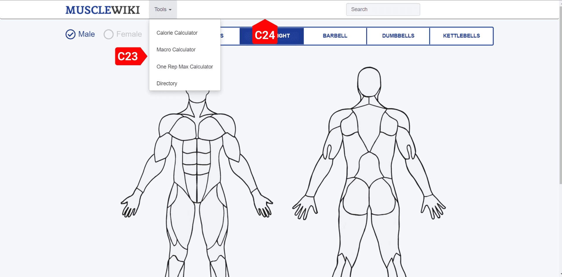
The MuscleWiki Website is used repeatedly by the users to check up on exercises and to use the nutrition tools. Currently the navigation bar has a lot of empty space (C24) and yet all the links and tools are hidden in a dropdown menu called “Tools” (C23). The user must always click the dropdown and then look for the link he wants to go to and then click again to go to the right page. This issue was revealed when I was analyzing the website with the rule “Enable Frequent Users to Use Shortcuts”. Even naming the dropdown menu as “Tools” is misleading since it also contains a link to list all exercises.
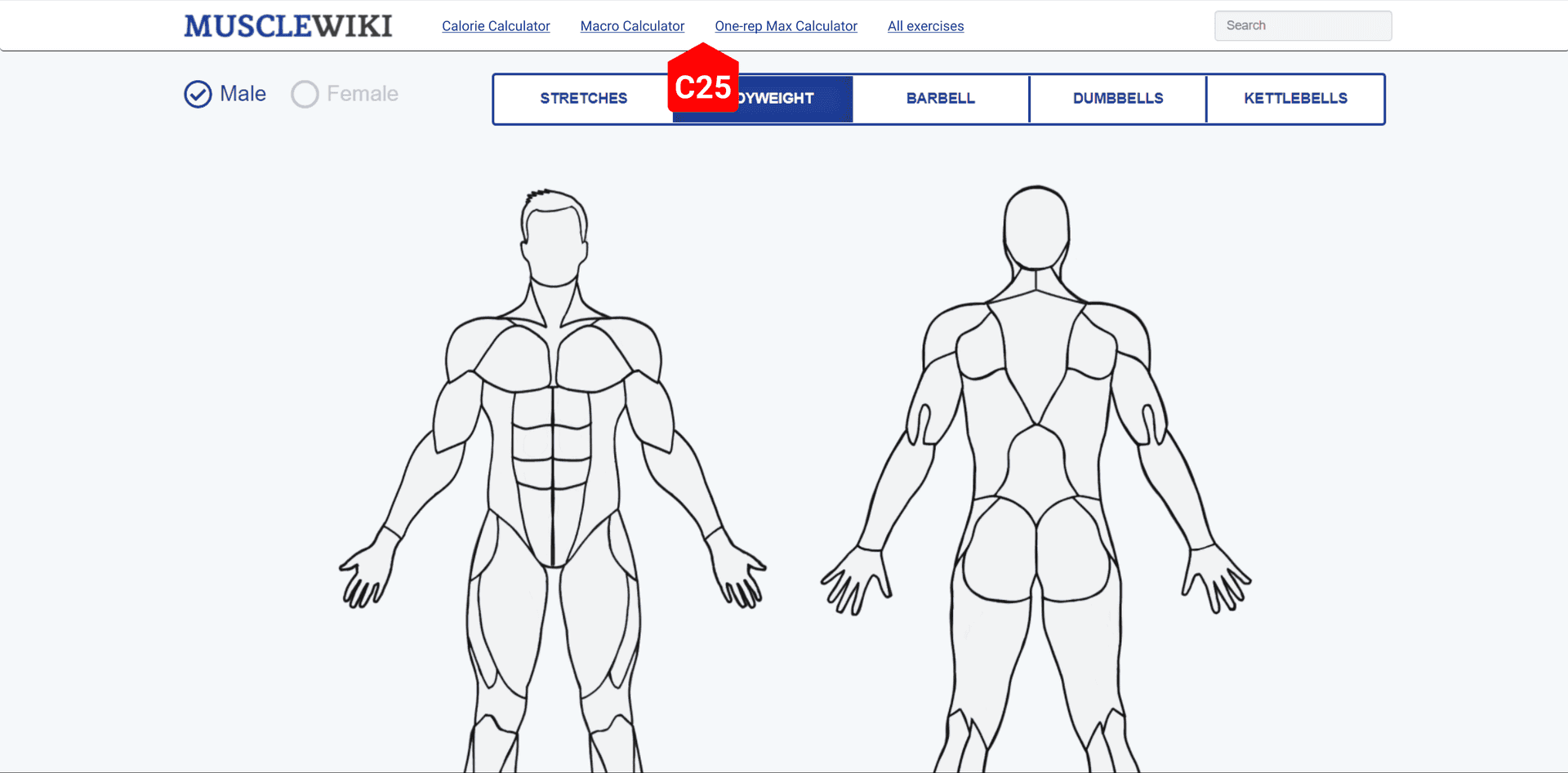
All the “Tools” dropdown menu items are spread out on the navigation bar so that the users can now directly jump to pages that they intend to visit (C25). This allows frequent users to use shortcuts as described by the rule “Enable Frequent Users to Use Shortcuts”.
Show the calorie count more distinctly
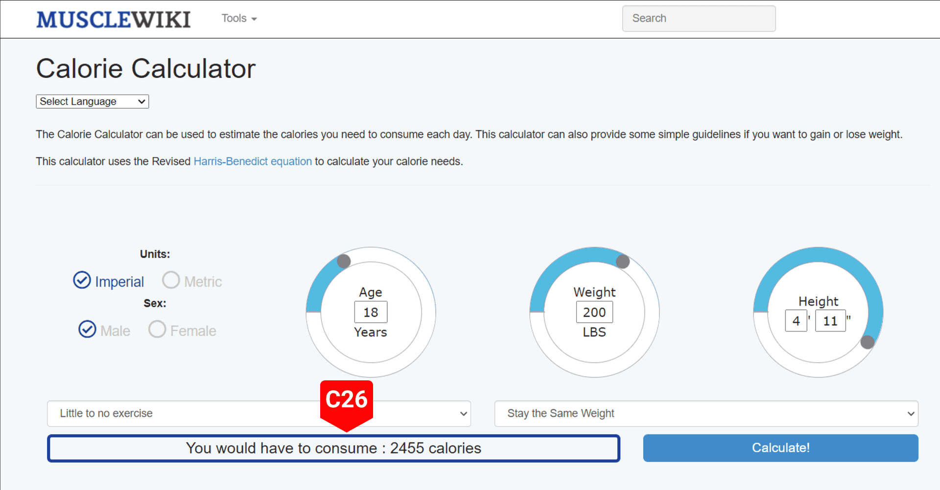
The calorie calculator interface on the website doesn’t show the calculated value distinctively. Instead, a user must search for it actively when looking for the value. The interface shows the result in an element that looks like a button (C26) and the user would certainly not expect the results to be present there. This issue is associated with the rule “Strive for Consistency”.
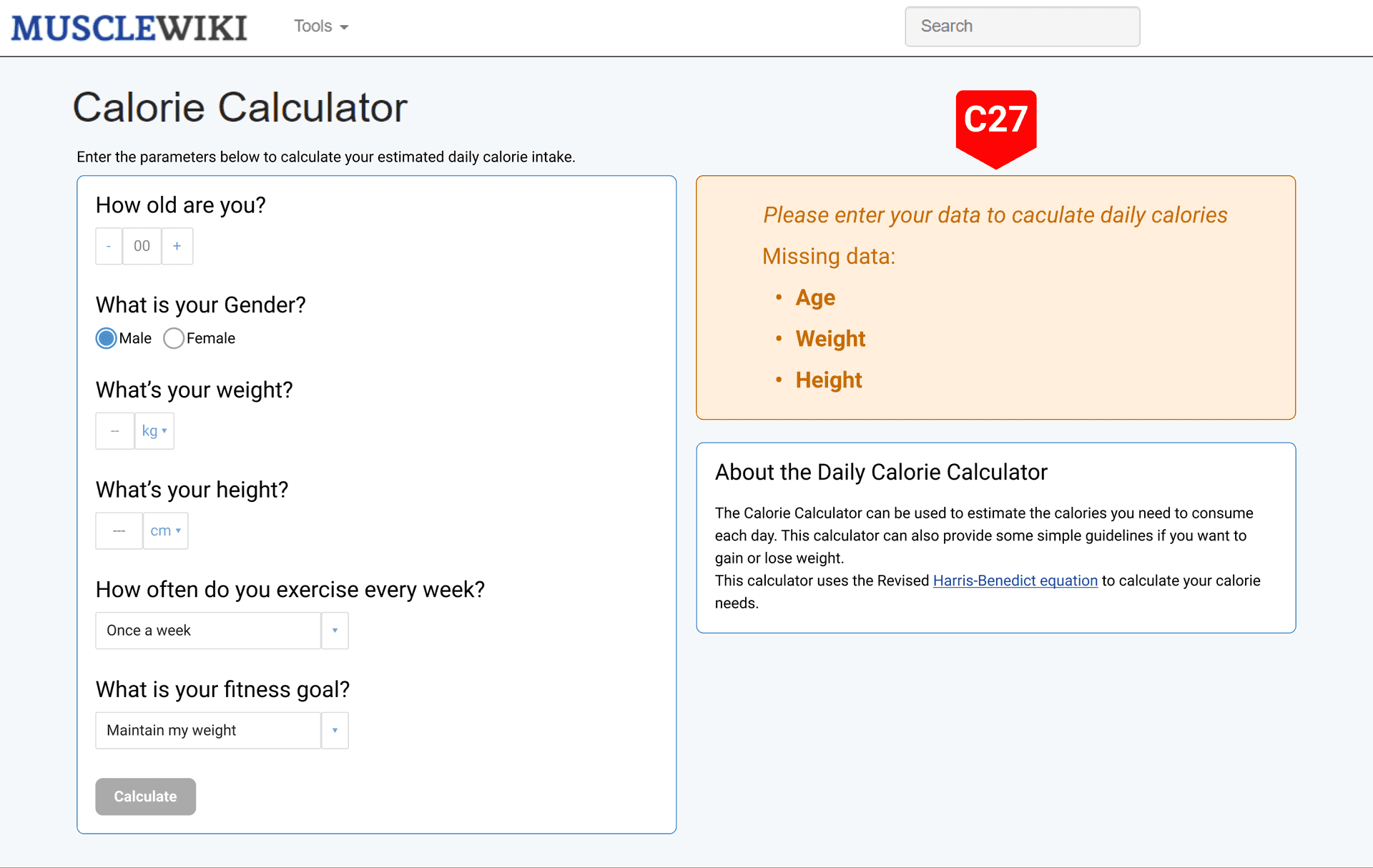
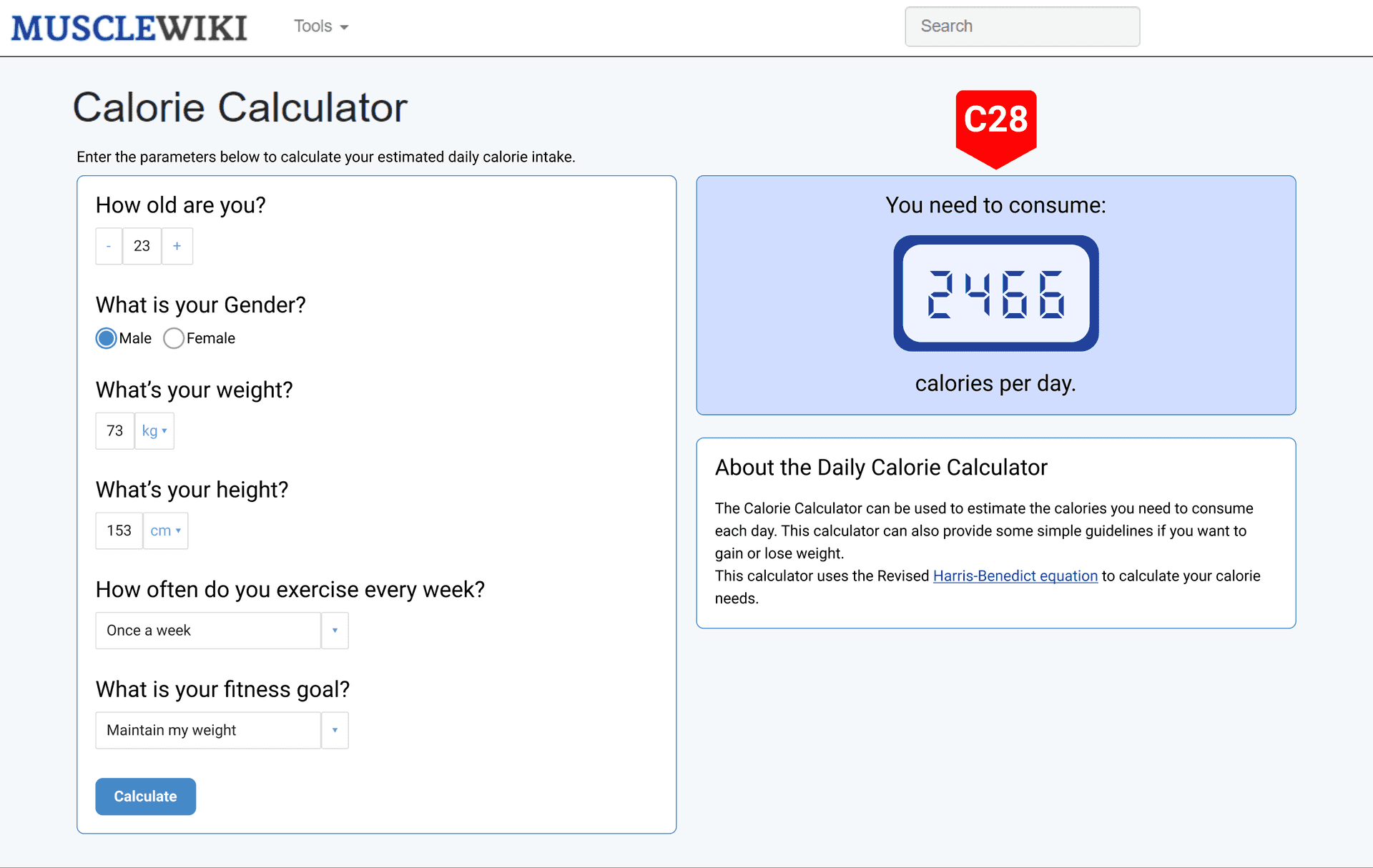
Augmenting to the “after” form interface showcased under “Using the knobs and controls of the calorie counter is hard” section, the results can be shown as a card element instead of making it look like a button. And having a distinctive background color for the card element makes sure that the user notices the element and investigates it when using the calculator (C28).
To add to this, having the calorie results card change color based on the status of the form and providing textual feedback on what the status is, or what errors to fix when trying to submit invalid data would help the users to use the tool successfully (Color of the card is orange in C27 with some suggestions on what to fix and changes to blue in C28, indicating successful form submission). This “offers simple error handling” and the helps user to yield closure when they see the calculated output on the blue colored card (Design dialogue to yield closure).
Adding breadcrumb navigation.
The MuscleWiki Website has multiple ways to reach the same information. This can become confusing to the users when they want to retry reaching the same information on their next visit. Thus, adding a breadcrumb navigation on each page will be helpful to the revisiting users. This can be attributed to the rule “Offer informative feedback.” because with breadcrumb navigation users will exactly know where they are in the whole sitemap and the rule “Reduce Short-Term Memory Load” because the breadcrumb navigation lays out clearly where the user is and the user need not remember it on their own thus choosing recognition over recall.
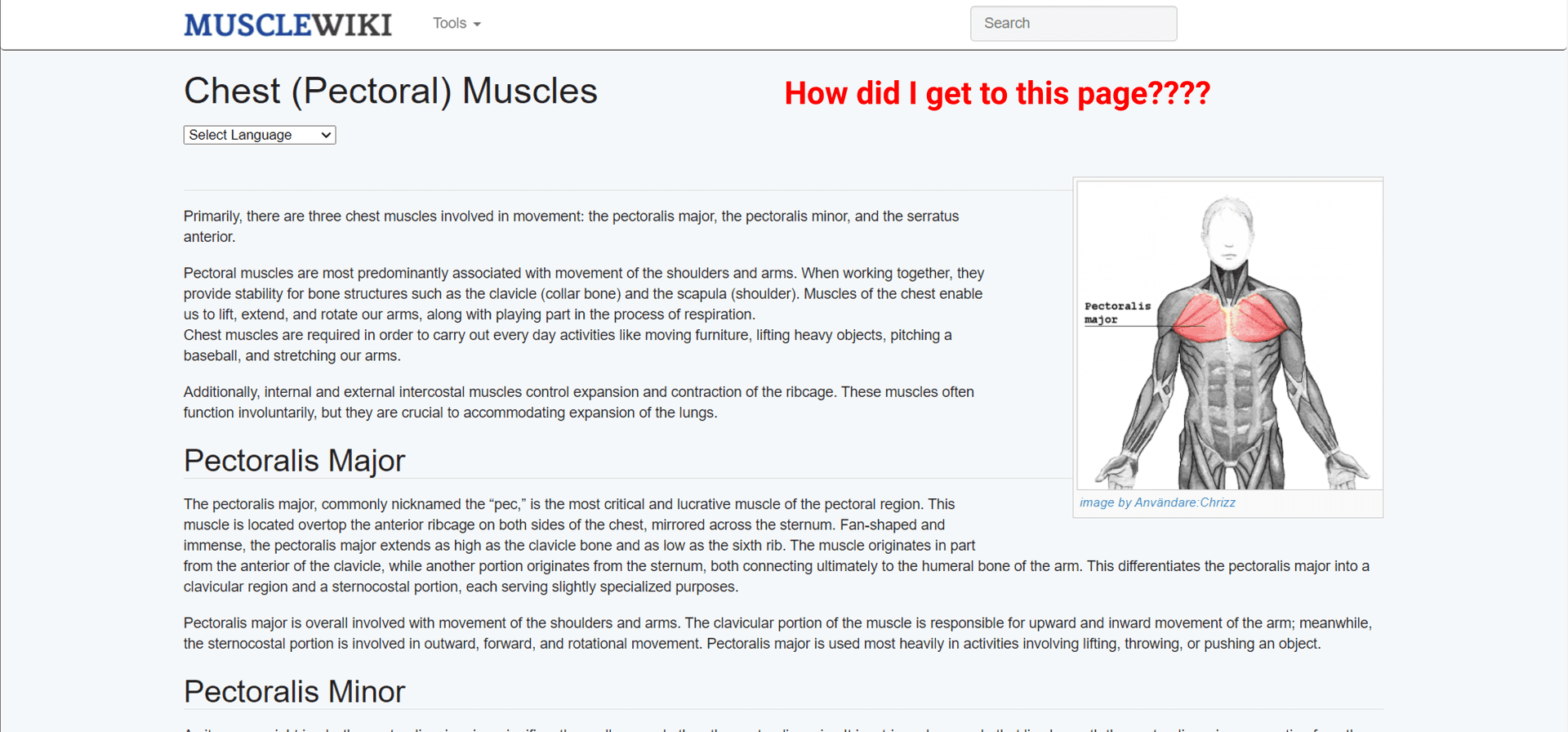
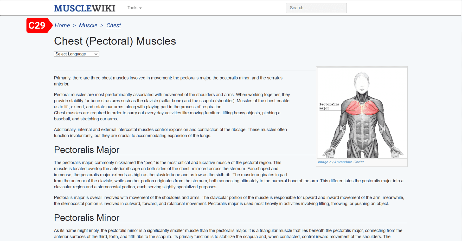
C29 has a breadcrumb navigation bar that shows exactly where the user stands on the whole website and helps navigate confidently.
Make Macro Calculator more intuitive
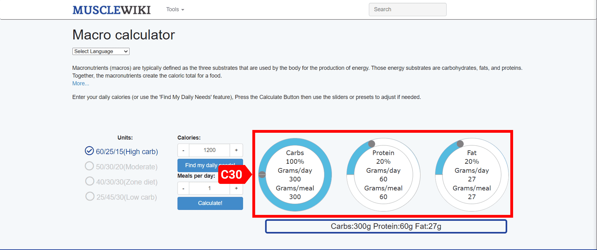
The Macro Calculator currently on the website “tries” to give a degree of freedom to the users to set different percentages for each macro nutrients apart from the 4 presets (Support Internal Locus of Control), but the user must keep track of the percentages in their minds. This will lead to erroneous results. (As seen from the image below, C30 shows that the percentage of carbs is 100 already and we still have 20% protein and 20% fat, which all sum to 140%, a wrong value. The users can rotate the knob sliders, but it is not responsive to keep the total percentage to 100).
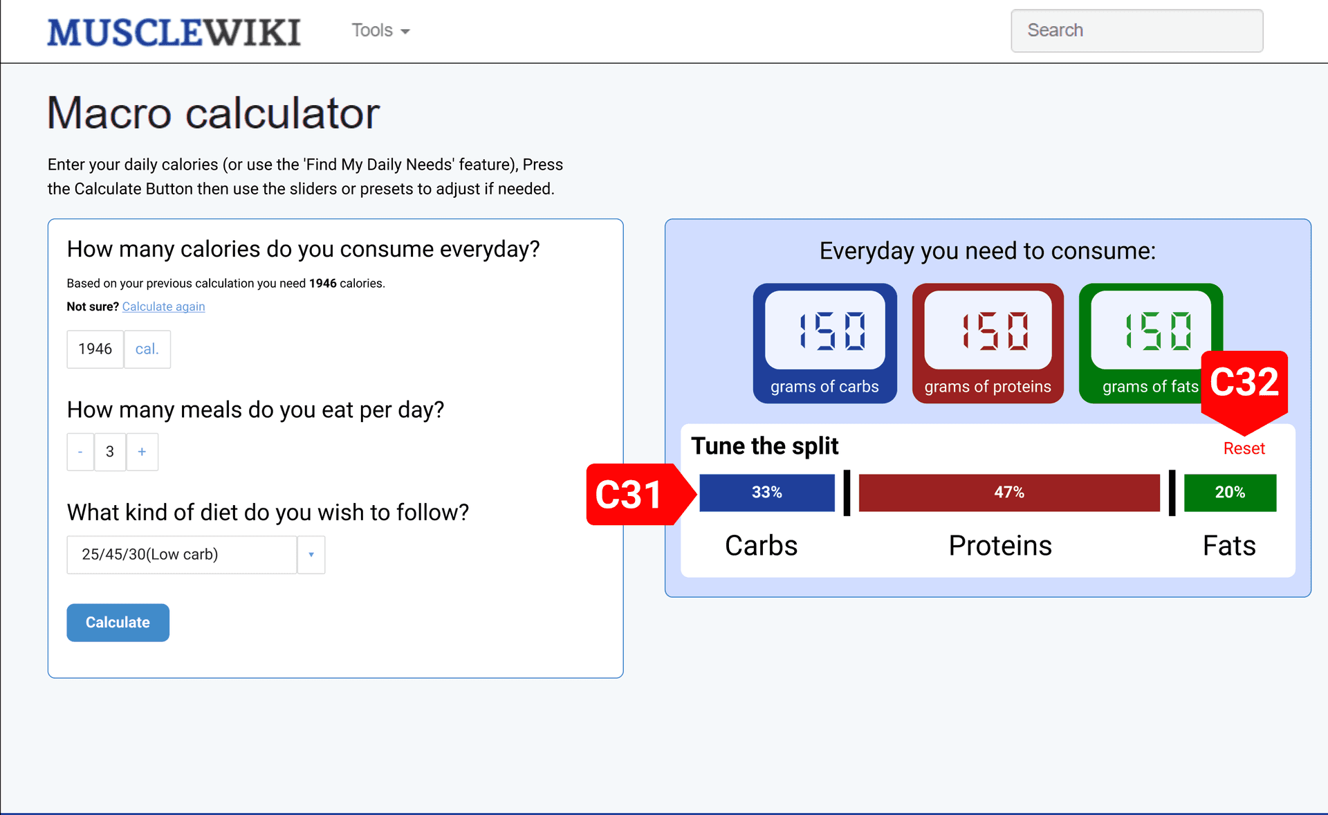
Extending the Macro Calculator designed in “Macro calculator doesn’t remember calculated daily calorie” section, the new interface can adjust the macro sliders (C31) as the users desire, the design of the sliders makes sure the sum is always a 100%. So now they need not keep track of percentages in their minds (Reduce Short-Term Memory Load.). Users can use the Reset button (C32) to go back to the results from the macro calculator which was based on the selected preset and other inputs (Permit Easy Reversal of Actions). Thus still giving the same amount of flexibility to the users (Support Internal Locus of Control).
Comparing and contrasting the findings from user-based testing and the heuristic review
The Expert Heuristics Review helped make more radical fixes to the interface of the website, that would make the website a much better experience, while the unmoderated user testing help find interface issues that would make the website incrementally better. I believe this is the case because user testing is limited by time and gives feedback only on what the users see and what tasks they do, while expert review starts with the intention to fix interface issues based on a set of rules and moreover the time spent on the interface is significantly greater than that of a user-based testing.
Some of the findings of the Heuristic Review had an indirect conformance from the way users interacted with the interface (apart from the task list) and helped make solid changes to the interface. For example, all the users somewhat unnoticeably struggled with the “Tools” dropdown menu. But user testing only revealed a part of the problem. (User U1 not connecting the word “Directory” with the phrase “list of all exercises”), and an incremental experience boost was suggested by changing the word “Directory” to “All Exercises”. The Heuristic Review however showed that there was no need of the dropdown menu at all, since there was so much empty space in the navigation bar and suggested a flat menu with all the dropdown items now in the navigation bar.
Some parts of the interface were so obscured that getting a user to even detect those features in limited time would’ve been a big chore (Even I was not aware of the feature until I started my expert review after the user-based testing). But these were detected in the expert review, since I spent significantly more time with the interface, I was able to find out about the problems with the feature. The example for this was the adjustable slider knobs on the Macro Calculator, which tried to serve as a more granular control to set the percentages apart from the preset values. The percentage sliders were supposed to work together and sum up to 100% but they were not connected to each other, giving sums greater than 100% or even less that 100%.
The findings of the unmoderated user testing and expert review went hand in hand in most of the situations, expert review outcomes sometimes augmented the resulting interfaces of the user testing to take it even further. But in one instance they had 2 separate directions (the “Tools” dropdown fix vs. the flattening of the Tools dropdown to the navbar). I think this is due to the order in which the tests were done. If we had started with Expert Review and followed it up with User Testing after changing the interface based on the outcomes of the Expert Review, we would not have 2 directions. (Since the interface was not in our control anyway, this would have had no effect for the users.)
References
Rhoades, J. (2005, February). Exercise in Adults, Age 18 and Older, in the United States, 2002: Estimates for the Noninstitutionalized Population. Statistical brief #70: Exercise in adults, age 18 and older, in the United States, 2002: Estimates for the noninstitutionalized population. Retrieved November 21, 2021, from https://meps.ahrq.gov/data_files/publications/st70/stat70.shtml.