GrubHub Android App — Heuristic Evaluation
February 3rd, 2022
4 minutes

What does Schneiderman’s golden rules reveal about the app.
Reduce Short-term Memory Load
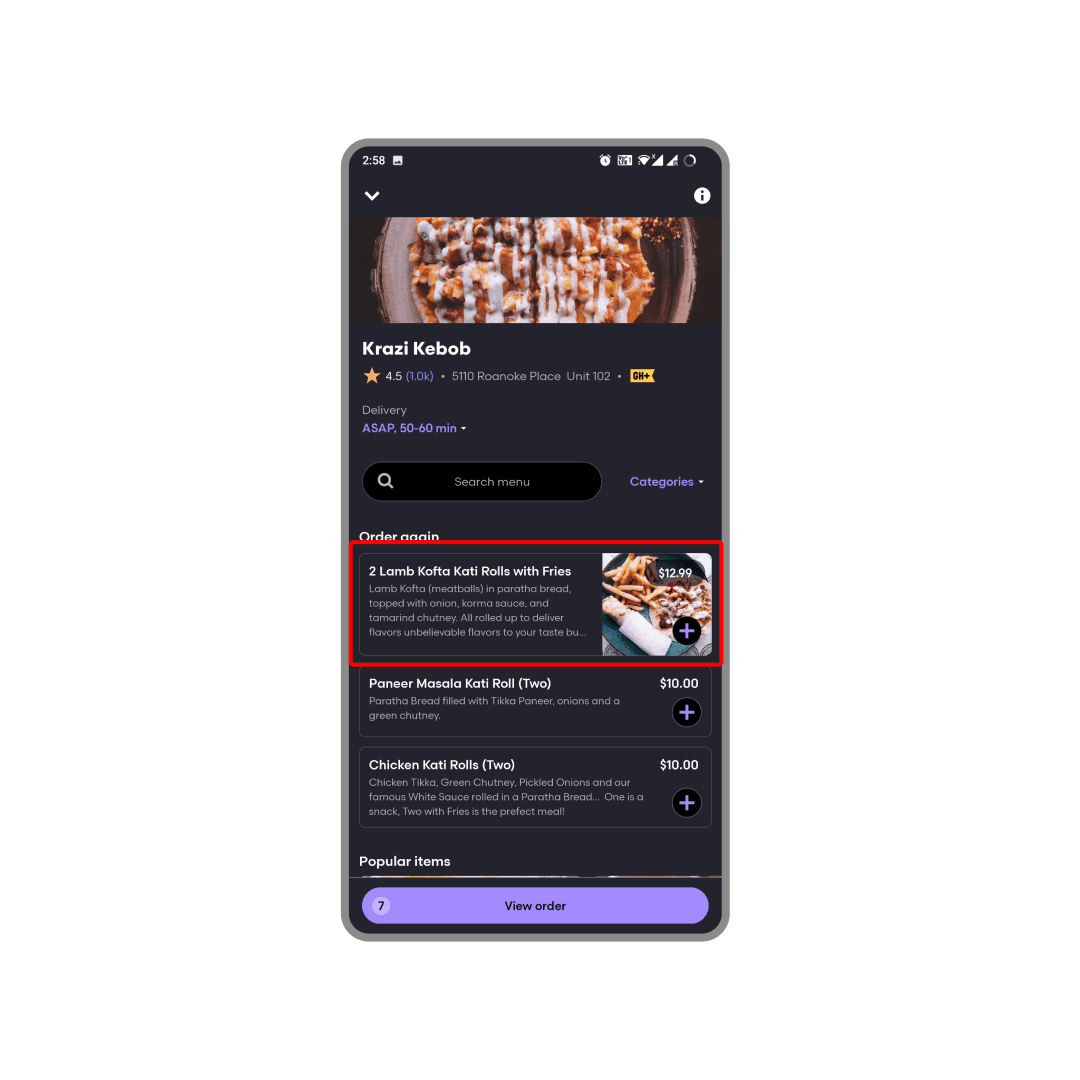
Problem
After adding some items on the restaurant page, I have to remember the quantity or visit my cart every time to see the quantity.
Recommendation
Show the quantity added to the cart within the restaurant page.
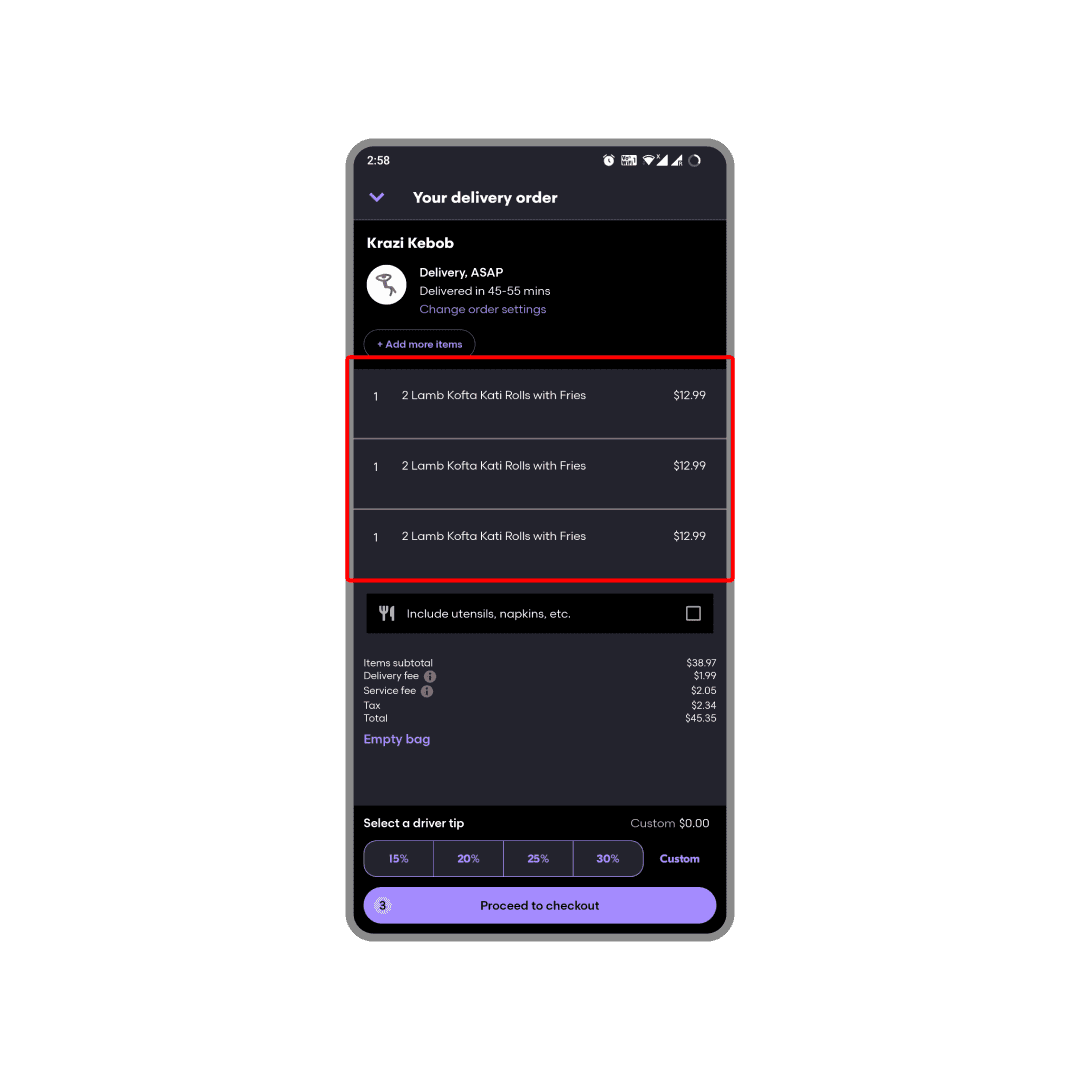
Problem
When I visit my cart page after adding a few same items from a restaurant, I have to manually count the items to calculate the quantity and remember it.
Recommendation
Club the same items together and display the unified quantities.
Permit easy reversal of actions
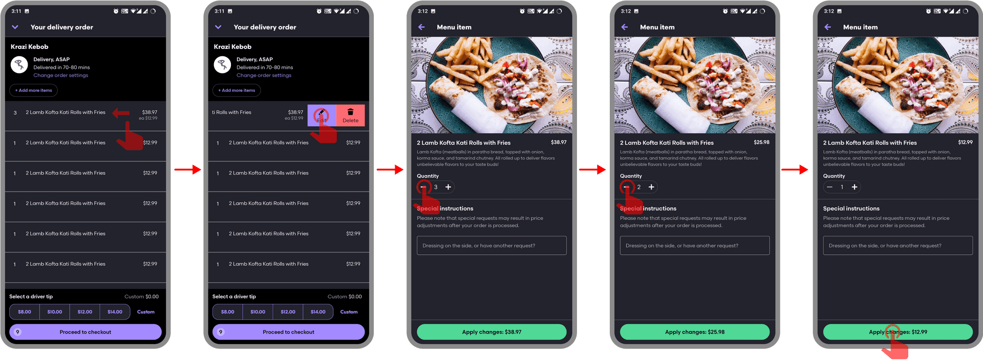
Problem
Let’s say I added 3 quantities of an item to my cart by mistake. Now to change the quantity to 1, I have to perform a complex 5 step action as shown above.
Recommendation
Make quantity editable within the item card on the cart page.
Strive for consistency
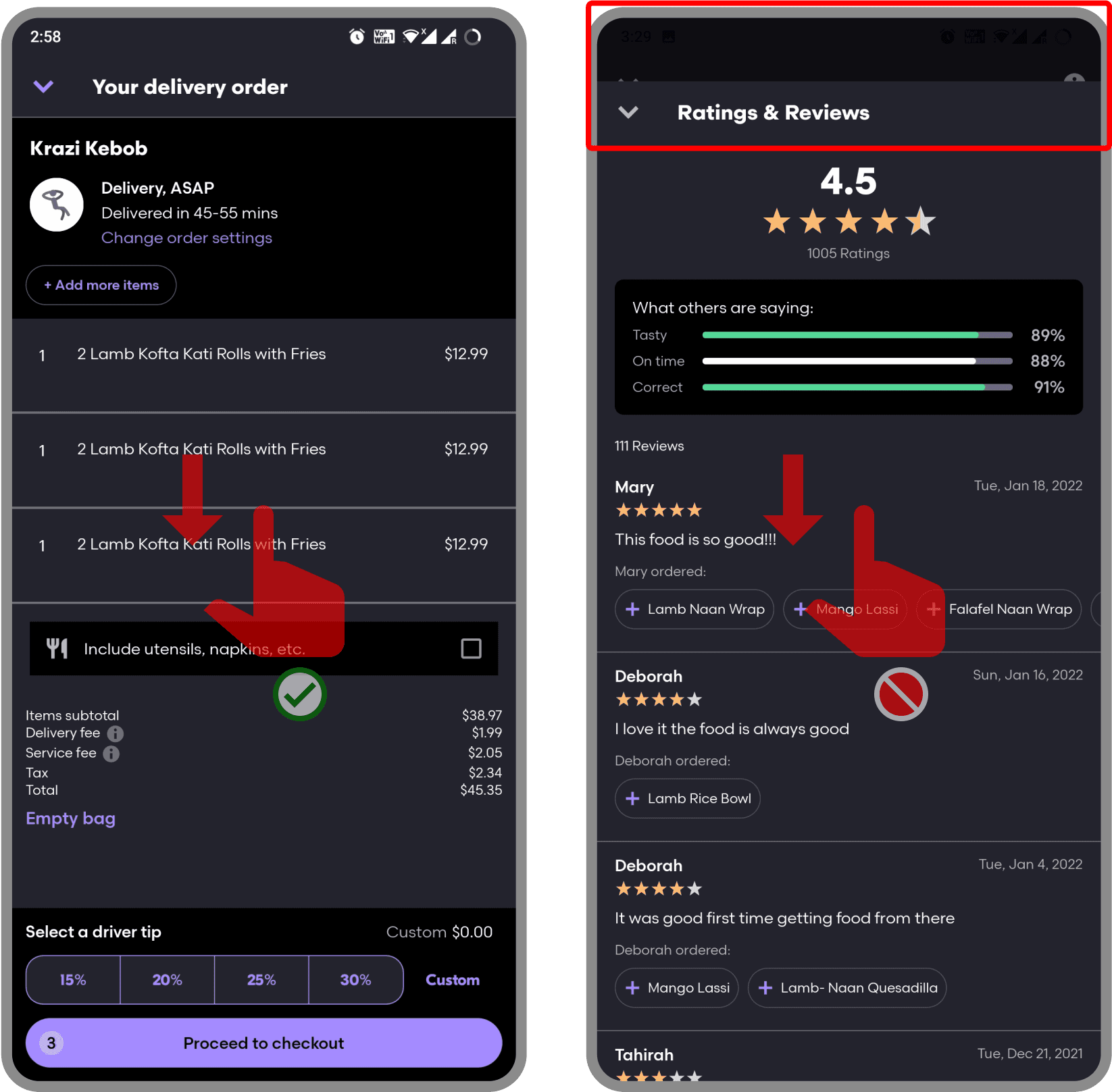
Problem
A swipe-down from “Your delivery order” screen closes the screen and shows the previous screen, but the swipe down gesture from restaurant review page triggered from the same restaurant page doesn’t close the page and come back to the previous screen. (Even though the design feels like it affords a swipe down gesture)
Recommendation
Choose a consistent behavior for the swipe-down action.
Offer simple error handling
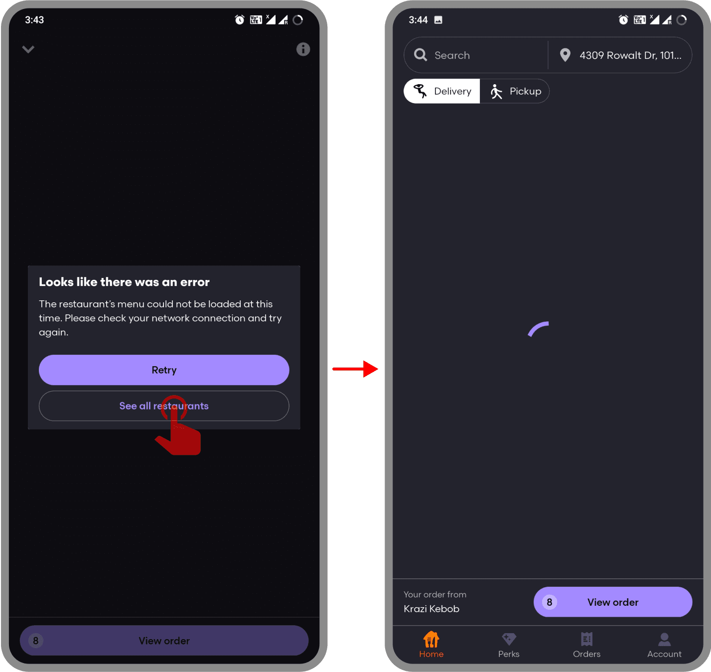
Problem
The button “See all restaurants” shown when there is no internet connection would confuse the users and also leads to an endless loading screen which doesn’t help the user.
Recommendation
Remove the button to avoid the confusion.
What does the MDA Framework reveal about the app
MDA Surprisingly can also be used to evaluate applications; in a way different than the conventional heuristics we generally employ.
Mechanics
The rules and actions a user follows when using the app. Rules have a direct consequence to behaviors.
- browse restaurants nearby
- check for offers and reviews of restaurants
- browse food menu from restaurants
- add food items from same restaurants into cart
- customize order
- specify tip amount
- choose payment option
- enter promo code
- check out and place order
Dynamics
These are the indirect consequences of the rules and actions while the user uses the app.
- User can look up restaurants and read reviews to decide on a restaurant when out for dining
- Users can check cart value to decide the right restaurant
- Users can scout for offers and order from restaurant with best offer
- Users can hunt for promocodes outside the platform
Aesthetics
These are the feelings that the app produces in the user that make them keep using the app.
Discovery
- When scouting for offers on the app
- When finding new restaurants to try
Challenge
- When hunting for promocodes outside the platform
What other aesthetics could GrubHub App aim for
Fellowship
Group orders could be a feature that can reduce the order cost to the user and indirectly helps grubhub get more orders.
- Users will actively reach out to their friends for a better deal
Expression
If the app analyzed all the previous orders and showed me what kinds of food I’m into, that would help me understand my food preferences better.
- This is something like Spotify Wrapped but with food (& more qualitative)
Comparing the different evaluation frameworks
What did MDA Framework offer
- The perspective that MDA offered, gave a holistic view of the application, revealing experience pitfalls and enhancements when looking at the app as a system.
- The emotional aspect being evaluated by the Aesthetics part of the framework helped to look at an application beyond its utilitarian nature, which helps build products that have an emotional value to the users, which is much more appreciated than just utility.
- The MDA way of evaluating an application also makes sure the goal of application is solid, which isn’t the case for Schneiderman’s Golden Rules.
- MDA also lets us explore indirect consequences of the mechanics of a system.
What MDA lacks
- There are no “guidelines” to evaluate an application using MDA, it is subjective and it just offers a different lens to look at a system.
- The “immediate experiences” of using an application is not focused with MDA, (Example: how should the system behave when an error occurs?) which makes it an incomplete tool for evaluating applications.
- Some applications are just meant for utility, introducing an emotional aspect to such application would negatively impact the experience. (For example, would we really need an emotional aspect for a calculator app?)
- MDA looks at a system without taking reusability into consideration
What did Schneiderman’s golden rules offer
- The focus on evaluating “immediate experiences” helps flatten out annoyances from the experience.
- The clear guidelines for evaluation made it simple and objective to evaluate the application.
- Since there are no different logical divisions of the application to be made, applying the rules on different elements, flows and screen helped unravel issues faster and consistently.
- Takes care of frequent users of a system
What Schneiderman’s golden rules lack
- The rules do not look at the big picture and emotions like how the MDA Framework does it.
- The goals of the users are not taken into consideration.
- Not having a way to componentize a system before evaluating leads to us missing the evaluation of some parts of the experience, which is circumvented by MDA (by the way it breaks down an application)